In This Topic
Step 1: Determine whether the population mean and the target are equivalent
Compare the confidence interval with the equivalence limits. If the confidence interval is completely within the equivalence limits, you can claim that the population mean is equivalent to the target. If part of the confidence interval is outside the equivalence limits, you cannot claim equivalence.
Difference: Mean(Force) - Target
| Difference | SE | 95% CI for Equivalence | Equivalence Interval |
|---|---|---|---|
| 0.28500 | 0.13831 | (0, 0.520586) | (-0.42, 0.42) |
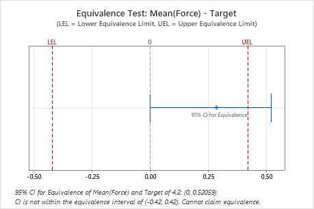
Key Results: 95% CI, Equivalence interval
In these results, the 95% confidence interval exceeds the upper equivalence limit. Therefore, you cannot claim that the population mean is equivalent to the target.
Note
If you selected an alternative hypothesis to test an inequality, rather than equivalence, evaluate the overall results by comparing the lower bound with the lower limit or the upper bound with the upper limit. For more information, go to Difference for 1-Sample Equivalence Test and click "Lower bound" or "Upper bound".
Step 2: Check your data for problems
Problems with your data, such as skewness or outliers, can adversely affect your results. Use graphs to look for skewness (by examining the spread of the data) and to identify potential outliers.
Determine whether the data appear to be skewed
When data are skewed, the majority of the data is toward the high or low side of the graph. Often, skewness is easiest to identify with a boxplot or histogram.
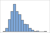
Right-skewed
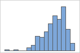
Left-skewed
For example, the right-skewed histogram shows salary data. Many employees are paid a relatively small amount, while increasingly few employees are paid large salaries. The left-skewed histogram shows failure rate data. A few items fail earlier while an increasing number of items fail later.
Data that are severely skewed can affect the validity of the test results if your sample is small (< 20 values). If your data are severely skewed and you have a small sample, consider increasing your sample size.
Identify outliers
Outliers, which are data points that are far away from most of the other data, can strongly affect your results. Outliers are easiest to identify on a boxplot.
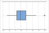
On a boxplot, outliers are identified by asterisks (*).
You should try to identify the cause of any outliers. Correct any data entry or measurement errors. Consider removing data that are associated with special causes and repeating the analysis. For more information on special causes, go to Using control charts to detect common-cause variation and special-cause variation.
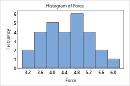
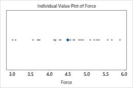
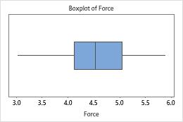
In these graphs, the data do not appear to be skewed and there are no outliers.