For information about data considerations, examples, and interpretation, go to Overview for Bar Chart.
Categorical variables
Enter one or more numeric columns that you want to graph.
Enter one or more numeric or date/time columns that you want to graph.
Summarized variables (optional)
Enter a column that defines the bars in the bar chart.
Function
From Function, select the function of the Summarized variables. For example, if you select Maximum, Minitab defines the color for the bar chart based on the maximum value of the summarized variables in each bar. If you enter a text column in Summarized variables, you can only select Percent equal to specified values, Number of nonmissing values, or Number of missing values.
- Percentile
- If you select Percentile, you must enter a value in Percentile value. The value must be between 0 and 100. Minitab uses the value you enter to define the color gradient in the bar chart. For example, if you enter 50, Minitab uses the 50th percentile to define the color gradient for each rectangle of the bar chart.
- Percent between two values
- If you select Percent between two values, you must enter numeric values in First value and Second value. The value you enter for First value must be less than or equal to the value you enter for Second value. Minitab defines the color gradient for the bar chart based on the percentage of observations that is between the two values.
- Percent equal to specified values
- If you select Percent equal to specified values, you must enter one or more values in Values. The values must be the same type of data as the column you entered in Summarized variables. Minitab defines the color gradient for the bar chart based on the percentage of observations that is equal to the values that you enter.
Layout
When you do not enter Summarized variables, you can choose one of the following layout options.
- Separate graphs for each categorical variable
- Minitab creates a separate bar chart for each column in the Categorical variables field.
- Overlay categorical variables
- Minitab creates a single bar chart that combines categorical variables into a multi-level axis in the order in which they appear in the Categorical variables field. The last variable is closest to the axis. The first variable is furthest from the axis. You can enter up to five categorical variables.
When you enter Summarized variables, you can choose one of the following layout options.
- Separate graph for each summarized variable
- Minitab creates a separate bar chart for each column in Summarized variables. All categorical variables are placed on the categorical scale.
- Overlay summarized variables
- Minitab creates a single bar chart that combines categorical variables into a multi-level axis in the order in which they appear in the Categorical variables. Additionally, multiple summarized variables are overlaid on the same graph. The summarized variables appear closest or furthest from the axis based on the option you choose for Variable display order.
Overlay
When you select multiple categorical variables and you choose to overlay the graphs, you can choose how to display the overlaid bars.
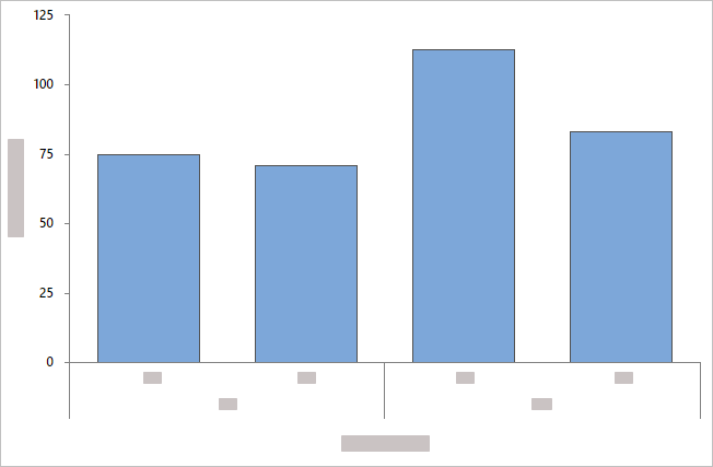
- Overlaid with evenly spaced bars
- By default, Minitab displays the bars evenly along the axis.
Categorical groups are displayed at different levels along the axis in the
order in which they appear in
Categorical variables.
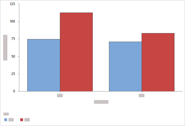
- Overlaid with clustered bars
- Minitab displays categorical groups as clustered bars and includes a
legend. You can change the grouping by reordering the variables in
Categorical variables,
or you can choose a different variable from
Cluster variable.
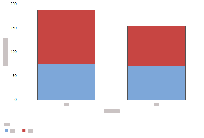
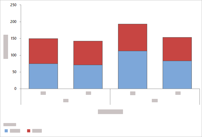
- Overlaid with stacked bars
- Minitab displays the categorical groups as stacked bars and includes a
legend. You can change the levels at which the categories appear by reordering
the variables in
Categorical variables,
or you can choose a different variable from
Stack variable.
Note
When you have more than one summarized variable and you choose to overlay
the graphs, you have the option to cluster or stack the bars by the summarized
variables.
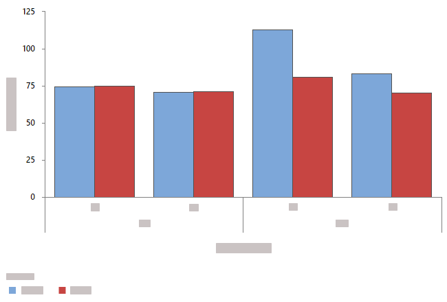
Clustered by summarized variables
Stacked by summarized variables
By variables
- Show all combinations
-
When you enter multiple By variables, Minitab enables the Show all combinations checkbox. Select this option to create a separate bar chart for each combination of groups created by the By variables. If you do not select this option, Minitab creates a plot for each group of each By variable.
For example, the first By variable has 2 groups, Male and Female, and the second By variable has 2 groups, Employed and Unemployed. If you select Show all combinations, Minitab creates 4 separate plots for the combinations of Male/Employed, Male/Unemployed, Female/Employed, and Female/Unemployed. If you do not select Show all combinations, Minitab creates 4 separate bar charts for Male, Female, Employed, and Unemployed.
Order bars by
- Default
- By default, when you graph counts of unique values or a function of a variable, Minitab arranges the bars in increasing order by category name (for example: Group 1, Group 2, Group 3).
- Increasing Y
- Arranges bars in increasing order based on Y values.
- Decreasing Y
- Arranges bars in decreasing order based on Y values.
Display counts as percent of total
When you do not enter Summarized variables, select this option to change the Y-scale type from count to percent.
Display function as percent of total
When you enter Summarized variables, select this option to change the Y-scale type to percent.
Same Y-scale
Make the Y-scale the same across multiple graphs.
Variable display order
Minitab uses the terms "innermost" and "outermost" to indicate the relative position of the scales for multiple levels of groups displayed on a graph. For a horizontal scale, outermost refers to the scale at the bottom of the graph, and innermost refers to the scale farthest from the bottom, closest to the horizontal axis. For a vertical scale, outermost refers to the scale to the far left, and innermost refers to the scale closest to the vertical axis.
Choose one of the following options when you have multiple Y variables with groups.
- Categorical variables first, Y's below
- Graph variables are the outermost groups and the categorical variables are the innermost groups.
- Y's first, categorical variables below
- Graph variables are the innermost groups and the categorical variables are the outermost groups.