About percentile lines
Percentile lines are specialized reference lines available only with probability plots and empirical CDF plots. A percentile line has two segments that intersect at the fitted distribution line. One segment is drawn to intersect the data scale and the other is drawn to intersect the other scale on the graph. This other scale can be a percent scale, a probability scale, or a score scale, depending on the option you have selected.
Percentile lines are often used for evaluations of test scores. For example, if you want to know the test score for the 95th percentile, you can add a percentile line at 95 percent. Minitab calculates the corresponding data value. Conversely, if you add a percentile line at the data value, Minitab calculates the corresponding percent.
Example of using percentile lines to evaluate test scores
An employee ranking at the 95th percentile achieved a test score of 31.64. In other words, 95% of the employees had a score of 31.64 or less.
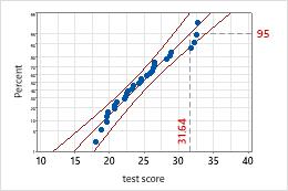
95th percentile
A test score of 27 is slightly higher than the 70th percentile. Slightly more than 70% of the employees had a score of 27 or less.
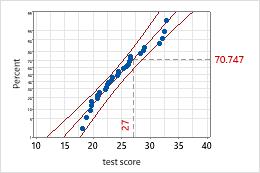
Test score of 27
Add percentile lines when you create a graph
You can add percentile lines when you create probability plots and empirical CDF plots.
- In the dialog box for the graph you are creating, click Scale.
- Click the Percentile Lines tab.
- Specify the percentile line positions and click OK.
Add percentile lines to an existing graph
You can add percentile lines to probability plots and empirical CDF plots.
- Double-click the graph.
- Right-click the graph and choose .
- Specify the percentile line positions and click OK.
Edit percentiles lines
You can edit a percentile lines color, size, line type, and label.
- Double-click the graph.
- Double-click the percentile line.
-
Select the tab to make the edits that you want.
- Attributes: Change the color, size, and type of line.
- Show: Choose to display the x-scale label, the y-scale label, or both.
Edit labels for percentile lines
By default, a percentile line includes a label on the x-axis and a label on the y-axis. The first time you click one of the labels, both labels are selected. Click the same label again to select only that label. (For more information, go to Select groups and single items on a graph.)
- Double-click the graph.
-
Select the labels to edit.
- To edit both labels for a percentile line, select both labels and then double-click the labels.
- To edit only the x-scale label or only the y-scale label, select the individual label and then double-click the label.
Tip
Click and drag to move a label.
-
Select the tab to make the edits that you want.
- Font: Change the size, color, style, or font of the labels.
- Show: If you edit both labels, you can choose to display the x-scale label, the y-scale label, or both.
- Alignment:
If you edit only the x-scale label or only the y-scale label, you can change
the position and orientation of the label. See the following examples:
- Text angle
- Rotate the labels. For example, rotating the labels on this
time series plot by 35 degrees makes it easier to read adjacent labels.
Text angle = 0 (default)
Text angle = 35
- Position
- Change the position of the label relative to the anchor point.
Under
Position,
choose
Custom,
then choose a position. The following examples show 3 of the available
positions.
Above (default)
Above, to the left
Below, to the right
- Offset
- Move the label horizontally or vertically relative to its
current position. Under
Offset,
choose
Custom,
then specify the horizontal or vertical distance to move the label.
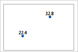
Horizontal 0, Vertical 0 (default)
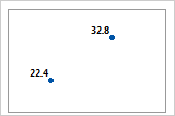
Horizontal –0.05, Vertical –0.05
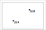
Horizontal 0.05, Vertical 0.05