In This Topic
About data labels
Data labels give information about individual data representations on a graph. Different graphs have different types of data representations. Therefore, some data label options are not available for some graphs. For example, you cannot label the bars of a histogram with row numbers from the worksheet. Usually, data labels come from the variables on the graph, but you can specify a column of custom labels.
Examples of data labels
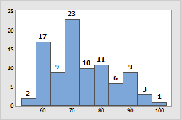
Histogram
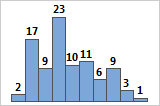
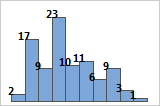
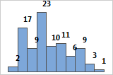
Bars are labeled with y-scale values.
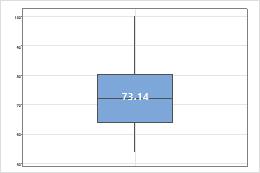
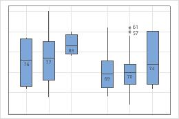
Boxplot
You can add labels to outliers, medians, means, and individual data. Here, the boxplot has a mean label.
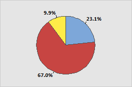
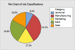
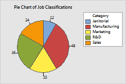
Pie Chart
You can add labels for individual slices with percent, frequency, and category names.
Add data labels when you create a graph
You can add data labels to most Minitab graphs.
- In the dialog box for the graph you are creating, click Labels.
- Click the Data Labels tab or the tab for the specific type of data labels, for example Slice Labels, for pie charts.
- Choose the label options specific to the graph and click OK.
Add data labels to an existing graph
You can add data labels to existing graphs.
- Double-click the graph.
- Right-click the graph and choose . For pie charts, choose .
- Choose the label options specific to the graph and click OK.
Data label options for most graphs
Label the data display with y-values, row numbers, or values from a column. For example, the bars on the following histogram are labeled with the exact frequency value for each bar.
- Use y-value labels
- Label symbols or bars with the corresponding y-axis value.
The labels on this histogram show the y-value, or the exact frequency, for each bar.
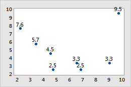
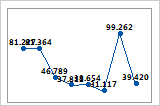
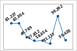
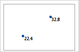
The symbols on this scatterplot show the y-value for each observation.
- Use row numbers
- Label symbols with the corresponding row numbers from the worksheet
(not available with histograms or bar charts). For example, each label in the
following bubble plot shows the row number for the corresponding observation in
the worksheet.
C1 C2 C3 X Y Size 6.8 2.5 9.5 9.7 9.5 1.2 9.0 3.3 8.5 ... ... ... 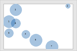
- Use labels from column
- Label symbols or bars with values from a column. For example, the
labels on the following bar chart are from the Fuel
Labels column.
C1 C2 C3 Combined MPG Fuel Fuel Labels 19.25 1 Gas 39.55 2 Hybrid 25.50 1 41.20 2 ... ... 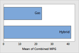
Data label options for pie charts
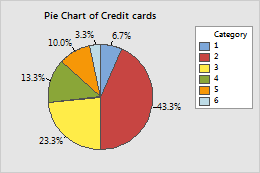
Label pie slices with category names, frequencies, or percentages. You can also draw a line from the label to the slice. For example, the following pie chart shows the number of credit cards that are held by survey respondents. The labels show the percentages for each slice. The lines help to associate the labels with their respective slices.
Slice labels and leader lines
On the Slice Labels or Show tab, you can choose from the following label options.
- Label Type
- You can add any or all of these label types to your pie chart. The
category name is the value of the categorical variable that is associated with
each slice.
Category name

Frequency
Percent
- Show leader lines
- To show the leader lines, select
Show leader lines
or
Draw a line from label to slice,
depending on which dialog box you are using. To edit the appearance of the
leader lines, double-click a label. On the
Leader
Lines
tab, change the type, color, or size of the leader lines.
Not selected (default)
Selected
Data label options for boxplots, interval plots, and individual value plots
Label one or more data display elements with y-values, row numbers, or values from a column. For example, the outliers in the following boxplot are labeled with the corresponding row number. The median lines are labeled with the medians (y-values).
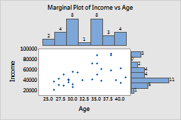
Data label options for marginal plots
When you create a marginal plot, you can label the bars of the histogram to show the frequency for each bin. In the dialog box, click Labels. On the Histogram Labels tab, select Label histogram bars with y-value.
Note
You cannot add data labels to an existing marginal plot.
Edit data labels
After you add data labels, you can edit them.
- Double-click the graph.
-
Double-click the labels to edit.
For more information on selecting labels, go to
Select groups and single items on a graph.
Tip
Click and drag to move a label.
-
Select the tab to make the edits that you want.
- Font: Change the color, style, size, or font. You can also change the text of individual data labels.
- Alignment:
Change the text angle, the position, and the offset of the label. See the
following examples:
- Text angle
- Rotate the labels. For example, rotating the labels on this
time series plot by 35 degrees makes it easier to read adjacent labels.
Text angle = 0 (default)
Text angle = 35
- Position
- Change the position of the label relative to the anchor point.
Under
Position,
choose
Custom,
then choose a position. The following examples show 3 of the available
positions.
Above (default)
Above, to the left
Below, to the right
- Offset
- Move the label horizontally or vertically relative to its
current position. Under
Offset,
choose
Custom,
then specify the horizontal or vertical distance to move the label.
Horizontal 0, Vertical 0 (default)
Horizontal –0.05, Vertical –0.05
Horizontal 0.05, Vertical 0.05