Pareto chart
The Pareto chart shows the absolute values of the standardized effects from the largest effect to the smallest effect. The reference line for statistical significance on the Pareto chart is drawn at Z, where Z is the (1 - α / 2) quantile of a standard normal distribution
The significance level is denoted by α or alpha. Unless you use a stepwise selection method that defines an alpha value, the significance level is 1 minus the confidence level for the analysis. To change the confidence level, go to the Options subdialog. If you use backwards selection or stepwise selection, the significance level is the significance level where Minitab removes a term from the model, known as Alpha to remove. If you use forward selection, the significance level is the significance level where Minitab adds a term to the model, known as Alpha to enter.
Interpretation
Note
The tests in the Deviance table are likelihood ratio tests, and provide p-values which are more reliable for small samples than these p-values, which are based on Z-values.
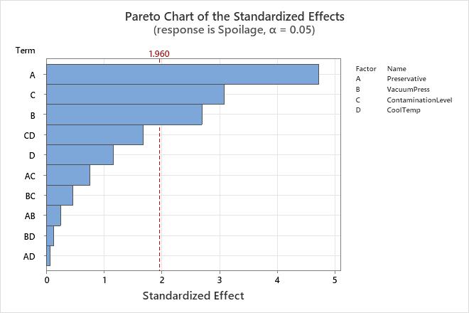
Because the Pareto chart displays the absolute value of the effects, you can determine which effects are large but you cannot determine which effects increase or decrease the response. Use the normal probability plot of the standardized effects to examine the magnitude and direction of the effects on one plot.
Normal plot of the effects
The normal probability plot of the effects shows the standardized effects relative to a distribution fit line for the case when all the effects are 0. Minitab plots the normal scores, probabilities or percentages versus the standardized effects. The line corresponds to a normal distribution with a standard deviation of 1. Effects with p-values less than α are labeled significant on the graph.
Positive main effects increase the response when the settings change from the low value of a factor to the high value. Negative main effects decrease the response when the settings change from the low value of a factor to the high value. Effects further from 0 on the x-axis have greater magnitude. Effects further from 0 are more statistically significant.
Whether an effect is statistically significant depends on the significance level (denoted by α or alpha). Unless you use a stepwise selection method that defines an alpha value, the significance level is 1 minus the confidence level for the analysis. To change the confidence level, go to the Options subdialog. If you use backwards selection or stepwise selection, the significance level is the significance level where Minitab removes a term from the model, known as Alpha to remove. If you use forward selection, the significance level is the significance level where Minitab adds a term to the model, known as Alpha to enter.
Interpretation
Use the normal probability plot of the effects to determine the magnitude, direction, and the importance of the effects. On the normal probability plot of the effects, effects that are further from 0 are statistically significant. The color and shape of the points differ between statistically significant and statistically insignificant effects. For example, on this plot, the main effects for factors A, B, and C are statistically significant at the 0.05 level. These points have a different color and shape from the points for the insignificant effects.
In addition, the plot indicates the direction of the effect. Preservative (A), Contamination Level (C), and Vacuum Press (B) all have a positive standardized effect. When process changes from the low level to the high level of the factors, the response increases.
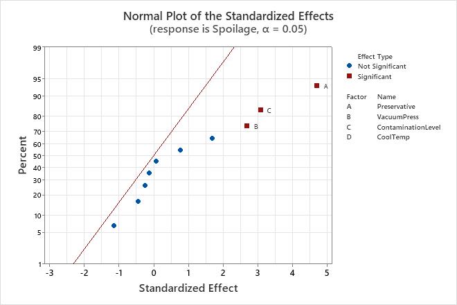
Because the normal probability plot of the effects displays negative effects on the left side of the graph and positive effects on the right side of the graph, comparisons about which effects change the response the most are more difficult than on plots that show the absolute values of the standardized effects. The half normal plot and the Pareto chart show the absolute values of the standardized effects.
Half normal plot of the effects
The half normal probability plot of the effects shows the absolute values of the standardized effects from the largest effect to the smallest effect. Minitab plots the normal scores, probabilities or percentages versus the standardized effects. The points are shown relative to a reference line for the case when all the effects are 0. The line corresponds to a normal distribution with a standard deviation of 1. Effects with p-values less than α are labeled significant on the graph.
Effects further from 0 on the x-axis have greater magnitude. Effects further from 0 are more statistically significant.
The distance that points must be from the reference line to be statistically significant depends on the significance level (denoted by α or alpha). Unless you use a stepwise selection method that defines an alpha value, the significance level is 1 minus the confidence level for the analysis. To change the confidence level, go to the Options subdialog. If you use backwards selection or stepwise selection, the significance level is the significance level where Minitab removes a term from the model, known as Alpha to remove. If you use forward selection, the significance level is the significance level where Minitab adds a term to the model, known as Alpha to enter.
Interpretation
Use the half normal probability plot of the effects to determine the magnitude and the importance of the effects. On the half normal probability plot of the effects, effects that are further from 0 are statistically significant. The color and shape of the points differ between statistically significant and statistically insignificant effects. For example, on this plot, the main effects for factors A, B, and C are statistically significant at the 0.05 level. These points have a different color and shape from the points for the insignificant effects. Also, Minitab puts labels on the statistically significant points.
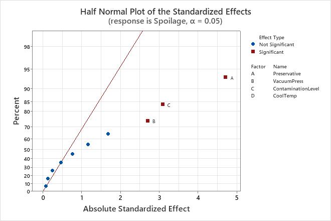
Because the half normal probability plot of the effects displays the absolute value of the effects, you can determine which effects are large but you cannot determine which effects increase or decrease the response. Use the normal probability plot of the standardized effects to see the magnitude and direction of the effects on one plot.