In This Topic
Step 1: Determine whether the association between the response and the term is statistically significant
- P-value ≤ α: The association is statistically significant
- If the p-value is less than or equal to the significance level, you can conclude that there is a statistically significant association between the response variable and the term.
- P-value > α: The association is not statistically significant
- If the p-value is greater than the significance level, you cannot conclude that there is a statistically significant association between the response variable and the term. You may want to refit the model without the term.
- If a fixed factor is significant, you can conclude that not all the level means are equal.
- If a random factor is significant, you can conclude that the factor contributes to the amount of variation in the response.
- If an interaction term is significant, the relationship between a factor and the response depends on the other factors in the term. In this case, you should not interpret the main effects without considering the interaction effect.
- If a covariate is statistically significant, you can conclude that changes in the value of the covariate are associated with changes in the mean response value.
- If a polynomial term is significant, you can conclude that the data contain curvature.
Coefficients
| Term | Coef | SE Coef | T-Value | P-Value | VIF |
|---|---|---|---|---|---|
| Constant | -4969 | 191 | -25.97 | 0.000 | |
| Temperature | 83.87 | 3.13 | 26.82 | 0.000 | 301.00 |
| GlassType | |||||
| 1 | 1323 | 271 | 4.89 | 0.000 | 3604.00 |
| 2 | 1554 | 271 | 5.74 | 0.000 | 3604.00 |
| Temperature*Temperature | -0.2852 | 0.0125 | -22.83 | 0.000 | 301.00 |
| Temperature*GlassType | |||||
| 1 | -24.40 | 4.42 | -5.52 | 0.000 | 15451.33 |
| 2 | -27.87 | 4.42 | -6.30 | 0.000 | 15451.33 |
| Temperature*Temperature*GlassType | |||||
| 1 | 0.1124 | 0.0177 | 6.36 | 0.000 | 4354.00 |
| 2 | 0.1220 | 0.0177 | 6.91 | 0.000 | 4354.00 |
Key Results: P-Value, Coefficients
In these results, the main effects for glass type and temperature are statistically significant at the significance level of 0.05. You can conclude that changes in these variables are associated with changes in the response variable.
Of the three types of glass in the experiment, the output displays the coefficients for two types. By default, Minitab removes one factor level to avoid perfect multicollinearity. Because the analysis uses the −1, 0, +1 coding scheme, the coefficients for the main effects represent the difference between each level mean and the overall mean. For example, glass type 1 is associated with light output that is 1323 units greater than the overall mean.
Temperature is a covariate in this model. The coefficient for the main effect represents the change in the mean response for a one-unit increase in the covariate, while the other terms in the model are held constant. For each one-degree increase in temperature, the mean light output increases by 83.87 units.
Both glass type and temperature are included in high-order terms that are statistically significant.
The two-way and three-way interaction terms for glass type and temperature are statistically significant. These interactions indicate that the relationship between each variable and the response depends on the value of the other variable. For example, the effect of glass type on light output depends on the temperature.
The polynomial term, Temperature*Temperature, indicates that the curvature in the relationship between temperature and light output is statistically significant.
You should not interpret the main effects without considering the interaction effects and curvature. To obtain a better understanding of the main effects, interaction effects, and curvature in your model, go to Factorial Plots and Response Optimizer.
Step 2: Determine how well the model fits your data
To determine how well the model fits your data, examine the goodness-of-fit statistics in the Model Summary table.
- S
-
Use S to assess how well the model describes the response. Use S instead of the R2 statistics to compare the fit of models that have no constant.
S is measured in the units of the response variable and represents how far the data values fall from the fitted values. The lower the value of S, the better the model describes the response. However, a low S value by itself does not indicate that the model meets the model assumptions. You should check the residual plots to verify the assumptions.
- R-sq
-
The higher the R2 value, the better the model fits your data. R2 is always between 0% and 100%.
R2 always increases when you add additional predictors to a model. For example, the best five-predictor model will always have an R2 that is at least as high as the best four-predictor model. Therefore, R2 is most useful when you compare models of the same size.
- R-sq (adj)
-
Use adjusted R2 when you want to compare models that have different numbers of predictors. R2 always increases when you add a predictor to the model, even when there is no real improvement to the model. The adjusted R2 value incorporates the number of predictors in the model to help you choose the correct model.
- R-sq (pred)
-
Use predicted R2 to determine how well your model predicts the response for new observations. Models that have larger predicted R2 values have better predictive ability.
A predicted R2 that is substantially less than R2 may indicate that the model is over-fit. An over-fit model occurs when you add terms for effects that are not important in the population. The model becomes tailored to the sample data and, therefore, may not be useful for making predictions about the population.
Predicted R2 can also be more useful than adjusted R2 for comparing models because it is calculated with observations that are not included in the model calculation.
- AICc and BIC
- When you show the details for each step of a stepwise method or when you show the expanded results of the analysis, Minitab shows two more statistics. These statistics are the corrected Akaike’s Information Criterion (AICc) and the Bayesian Information Criterion (BIC). Use these statistics to compare different models. For each statistic, smaller values are desirable. Minitab does not show these statistics or perform stepwise methods when the data include random factors.
-
Small samples do not provide a precise estimate of the strength of the relationship between the response and predictors. For example, if you need R2 to be more precise, you should use a larger sample (typically, 40 or more).
-
Goodness-of-fit statistics are just one measure of how well the model fits the data. Even when a model has a desirable value, you should check the residual plots to verify that the model meets the model assumptions.
Model Summary
| S | R-sq | R-sq(adj) | R-sq(pred) |
|---|---|---|---|
| 19.1185 | 99.73% | 99.61% | 99.39% |
Key Results: S, R-sq, R-sq (adj), R-sq (pred)
In these results, the model explains 99.73% of the variation in the light output of the face-plate glass samples. For these data, the R2 value indicates the model provides a good fit to the data. If additional models are fit with different predictors, use the adjusted R2 values and the predicted R2 values to compare how well the models fit the data.
Step 3: Determine whether your model meets the assumptions of the analysis
Use the residual plots to help you determine whether the model is adequate and meets the assumptions of the analysis. If the assumptions are not met, the model may not fit the data well and you should use caution when you interpret the results.
For more information on how to handle patterns in the residual plots, go to Residual plots for Fit General Linear Model and click the name of the residual plot in the list at the top of the page.
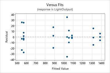
Residuals versus fits plot
Use the residuals versus fits plot to verify the assumption that the residuals are randomly distributed and have constant variance. Ideally, the points should fall randomly on both sides of 0, with no recognizable patterns in the points.
| Pattern | What the pattern may indicate |
|---|---|
| Fanning or uneven spreading of residuals across fitted values | Nonconstant variance |
| Curvilinear | A missing higher-order term |
| A point that is far away from zero | An outlier |
| A point that is far away from the other points in the x-direction | An influential point |
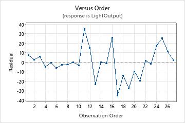
Residuals versus order plot
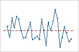
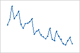
Trend
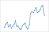
Shift
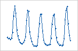
Cycle
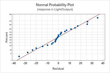
Normal probability plot of the residuals
Use the normal probability plot of the residuals to verify the assumption that the residuals are normally distributed. The normal probability plot of the residuals should approximately follow a straight line.
| Pattern | What the pattern may indicate |
|---|---|
| Not a straight line | Nonnormality |
| A point that is far away from the line | An outlier |
| Changing slope | An unidentified variable |