In This Topic
Plotted points
The plotted points are the unweighted moving averages over time. Moving averages are calculated from artificial subgroups of consecutive observations.
Interpretation
If the process is in control, the points vary randomly around the center line, and the process exhibits only common-cause variation. Investigate points that fall outside the control limits or that exhibit nonrandom patterns for possible special-cause variation.
Center line
The center line for the Moving Average chart is an estimate of the process average.
Interpretation
Use the center line to observe how the process performs compared to the average. If the process is in control, then the points vary randomly around the center line.
CAUTION
Do not confuse the center line with the target value for your process. The target is your desired outcome. The center line is the actual outcome.
Control limits
CAUTION
Do not confuse control limits with specification limits. Specification limits represent customer requirements and indicate the amount of variation that you want to see in the process. Control limits represent the actual amount of variation that is in the sample data. A process can be in control, yet not be capable of meeting specifications.
Test for special causes
The tests for special causes assess whether the plotted points are randomly distributed within the control limits.
Interpretation
Use the tests for special causes to determine which observations you may need to investigate and to identify specific patterns and trends in your data. The test for special causes detects a specific pattern or trend in your data, which reveals a different aspect of process instability.
Standard deviation
The standard deviation measures the overall variability in the data. Minitab does not display the standard deviation on the chart, but uses it to calculate the center line and the control limits. To store the standard deviation in the worksheet, select it on the Storage tab of the Options dialog box.
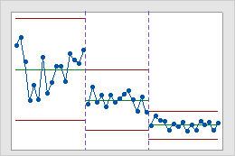
Stages
Use stages to create a historical control chart that shows how a process changes over specific periods of time. By default, Minitab recalculates the center line and control limits for each stage. For more information, go to Add stages to show how a process changed.
Interpretation
This historical control chart shows three stages of a process, which represent before, during, and after the implementation of a new procedure.