Use Matrix Plot to assess the relationships between several pairs of variables at once. A matrix plot is an array of scatterplots. There are two types of matrix plots: Matrix of plots and Each Y versus each X.
- Matrix of plots
-
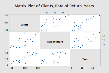
This type of matrix plot accepts up to 20 variables and creates a plot for every possible combination. A matrix of plots is effective when you have many variables and you would like to see relationships among pairs of variables.
For example, a business analyst creates a matrix of plots to explore the relationships between several business metrics. The plot shows every combination of number of clients, rate of return, and number of years in business.
- Each Y versus each X
-
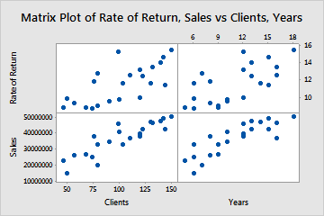
This type of matrix plot accepts y- and x-axis variables, then creates a plot for each possible xy combination. The Each Y versus each X matrix plot is effective when you are only interested in relationships among certain pairings of variables.
For example, a business analyst creates a matrix plot of each Y versus each X to examine the effect of the number of clients on sales and on the rate of return, and the effect of the number of years in business on sales and on the rate of return.
Where to find this graph
To create a matrix plot, choose .
When to use an alternate graph
If you want to visually compare the Pearson correlation coefficients between each pair of variables with a color gradient, consider using a Correlogram instead.