This topic is about the time scale on a control chart, such as the x-axis on an Xbar chart. For information on other scale types, click one of the following links.
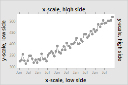
Graph scale elements are axis lines, axis labels, tick marks, and tick labels. You can display these elements on the high side or the low side of the graph's data region.
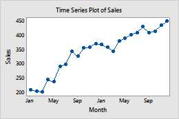
For example, on the following time series plot, the continuous (y) scale displays tick labels with tick marks on the low side. The time (x) scale displays tick labels with tick marks on the low side. Axis lines are on all sides.
To specify which elements to include when you create a graph, use the following steps:
Click Scale.
On the Axes and Ticks tab, select the elements to show.
To change or add the elements on an existing graph, use the following steps:
Double-click the graph.
Double-click the scale to open the Edit
Scale dialog box.
On the Show tab, select the elements to show.
Specify the time scale labels
A time scale represents chronological time in equally-spaced intervals. You can select the labels to use for the equally-spaced time units.
To specify the labels to use when you create a graph, use the following steps:
Click Scale.
On the Time tab, specify the labels.
To change or add the labels on an existing graph, use the following steps:
Double-click the graph.
Double-click the scale to open the Edit
Scale dialog box.
On the Time tab, specify the labels.
Index
Label the x-axis with the number of the subgroup.
Stamp
Label the x-axis with values from a column. In Stamp columns (1-3, innermost first), enter up to three columns that contain date/time, numeric, or text values for the scale.
Change the position of the tick marks
When you create a graph, Minitab sets the tick mark positions to fit the time scale. To change the tick mark positions, use the following steps:
Double-click the graph.
Double-click the scale to open the Edit
Scale dialog box.
On the Scale tab, under Tick Positions, specify one of the following:
Automatic
Display the tick marks in their default positions.
Specify tick positions
Enter the tick position numbers at which you want tick marks to appear. You can enter a series of numbers or specify a range of values. Use a colon between two numbers to indicate the range. Use a slash after the range to indicate an increment amount. For example, 5:30/5 places tick marks at 5, 10, 15, 20, 25, and 30.
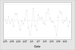
For example, on the time series plot with custom tick mark positions, the first tick mark on the time scale is at position 4 (April). The increment is 3 (every third month).
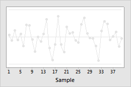
Default tick mark positions
Custom tick mark positions
Note
You can specify the time scale values and range on the Time tab.
Change the scale range
For a time scale, Minitab sets the scale range so that the observations extend the length of the axis. If you want to compress or expand the display of observations on the axis, use the following steps:
Double-click the graph.
Double-click the scale to open the Edit
Scale dialog box.
On the Scale tab, under Scale Range, deselect Auto for Minimum or Maximum, then enter the new minimum or maximum.
Change the axis line attributes and tick orientation
To change the color, size, and line type of the axis lines and tick marks, and the orientation of tick marks and the length of major tick marks, use the following steps:
Double-click the graph.
Double-click the scale to open the Edit
Scale dialog box.
On the Attributes tab, specify the options.
The following images illustrate the tick orientation.
Outside
Inside
Out and In
Change the tick mark labels
When you create a graph, Minitab uses data values as tick mark labels. To specify custom tick mark labels on an existing graph, use the following steps:
Double-click the graph.
Double-click the scale to open the Edit
Scale dialog box.
On the Labels tab, select Specified, then enter custom labels, separated by spaces.
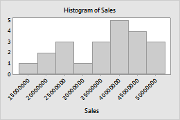
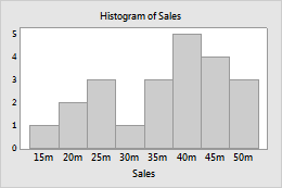
For example, on the first graph, the default labels are rotated because they are too long to fit. The shorter custom labels on the second graph fit better.
Default tick mark labels
Custom tick mark labels
Edit the font for the tick mark labels on the Font tab. Change the angle of tick mark labels on the Alignment tab.
Change the axis labels
To edit an axis label, use the following steps:
Double-click the graph.
Double-click the axis label to open the Edit Axis
Label dialog box.
Select the tab to make the edits that you want.
Font: Edit the text, and the font.
Alignment: Specify the text angle and the position relative to the default location.