In This Topic
Step 1: View each variable's contribution to the sum
Minitab plots multiple time series stacked on the y-axis against equally spaced time intervals on the x-axis. Each line on the graph represents cumulative sum; therefore, you can see each variable's contribution to the sum and how the composition of the sum changes over time.
Step 2: Look for outliers and sudden shifts
Use your process knowledge or area expertise to determine whether outliers or sudden shifts indicate errors or an actual change due to a cause.
Outliers
Look for unusual observations, also called outliers. Try to identify the cause of any outliers and correct any data-entry errors or measurement errors. Consider removing data values that are associated with abnormal, one-time events, which are also called special causes.
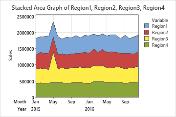
The following area graph of sales volume shows an outlier for Region 3 that was caused by a data-entry error. A sales manager accidentally entered the value 945,000 in the worksheet instead of 445,000 for monthly sales.
Sudden shifts
Look for sudden shifts in the series or sudden changes to trends. Try to identify the cause of such changes.
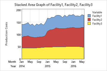
The following area graph of production costs shows a sudden shift in the costs at Facility 2 at the beginning of 2015. You should investigate the reason for the shift.
Step 3: Assess the general movement of the series
Trends
Look for a trend for each category and compare trends across categories. A trend is a long-term increase or decrease in the data values. A trend can be linear, or it can exhibit some curvature.
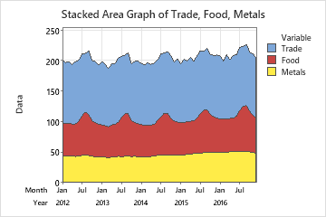
Cyclic movements or seasonal patterns
Look for cyclic movements or seasonal patterns. A seasonal pattern is a rise and fall in the data values that repeats regularly over the same time period. For example, orders at an auto parts store are low each Monday, increase during the week, and peak each Friday. Seasonal patterns always have a fixed and known period. In contrast, a cyclic movement is a rise and fall in the data values that does not appear to repeat at regular intervals. Typically, cyclic movements are longer and more variable than seasonal patterns.
Tip
If your data show trends, cycles, or seasonality, you can use a time series analysis to model the data and generate forecasts. For more information on which analysis to use, go to Which time series analysis should I use?