Note
This command is available with the Predictive Analytics Module. Click here for more information about how to activate the module.
A team of researchers collects and publishes detailed information about factors that affect heart disease. Variables include age, sex, cholesterol levels, maximum heart rate, and more. This example is based on a public data set that gives detailed information about heart disease. The original data are from archive.ics.uci.edu.
After initial exploration with CART® Classification to identify the important predictors, the researchers use both TreeNet® Classification and Random Forests® Classification to create more intensive models from the same data set. The researchers compare the model summary table and the ROC plot from the results to evaluate which model provides a better prediction outcome. For results from the other analyses, go to Example of CART® Classification and Example of Random Forests® Classification.
- Open the sample data, HeartDiseaseBinary.MWX.
- Choose .
- From the drop-down list, select Binary response.
- In Response, enter Heart Disease.
- In Response event, select Yes to indicate that heart disease has been identified in the patient.
- In Continuous predictors, enter Age, Rest Blood Pressure, Cholesterol, Max Heart Rate, and Old Peak.
- In Categorical predictors, enter Sex, Chest Pain Type, Fasting Blood Sugar, Rest ECG, Exercise Angina, Slope, Major Vessels, and Thal.
- Click OK.
Interpret the results
For this analysis, Minitab grows 300 trees and the optimal number of trees is 298. Because the optimal number of trees is close to the maximum number of trees that the model grows, the researchers repeat the analysis with more trees.
Model Summary
| Total predictors | 13 |
|---|---|
| Important predictors | 13 |
| Number of trees grown | 300 |
| Optimal number of trees | 298 |
| Statistics | Training | Test |
|---|---|---|
| Average -loglikelihood | 0.2556 | 0.3881 |
| Area under ROC curve | 0.9796 | 0.9089 |
| 95% CI | (0.9664, 0.9929) | (0.8759, 0.9419) |
| Lift | 2.1799 | 2.1087 |
| Misclassification rate | 0.0891 | 0.1617 |
Example with 500 trees
- Select Tune Hyperparameters in the results.
- In Number of trees, enter 500.
- Click Display Results.
Interpret the results
For this analysis, there were 500 trees grown and the optimal number of trees is 351. The best model uses a learning rate of 0.01, uses a subsample fraction of 0.5, and uses 6 as the maximum number of terminal nodes.
Method
| Criterion for selecting optimal number of trees | Maximum loglikelihood |
|---|---|
| Model validation | 5-fold cross-validation |
| Learning rate | 0.01 |
| Subsample selection method | Completely random |
| Subsample fraction | 0.5 |
| Maximum terminal nodes per tree | 6 |
| Minimum terminal node size | 3 |
| Number of predictors selected for node splitting | Total number of predictors = 13 |
| Rows used | 303 |
Binary Response Information
| Variable | Class | Count | % |
|---|---|---|---|
| Heart Disease | Yes (Event) | 139 | 45.87 |
| No | 164 | 54.13 | |
| All | 303 | 100.00 |
Method
| Criterion for selecting optimal number of trees | Maximum loglikelihood |
|---|---|
| Model validation | 5-fold cross-validation |
| Learning rate | 0.001, 0.01, 0.1 |
| Subsample fraction | 0.5, 0.7 |
| Maximum terminal nodes per tree | 6 |
| Minimum terminal node size | 3 |
| Number of predictors selected for node splitting | Total number of predictors = 13 |
| Rows used | 303 |
Binary Response Information
| Variable | Class | Count | % |
|---|---|---|---|
| Heart Disease | Yes (Event) | 139 | 45.87 |
| No | 164 | 54.13 | |
| All | 303 | 100.00 |
Optimization of Hyperparameters
| Model | Optimal Number of Trees | Average -Loglikelihood | Area Under ROC Curve | Misclassification Rate | Learning Rate | Subsample Fraction | Maximum Terminal Nodes |
|---|---|---|---|---|---|---|---|
| 1 | 500 | 0.542902 | 0.902956 | 0.171749 | 0.001 | 0.5 | 6 |
| 2* | 351 | 0.386536 | 0.908920 | 0.175027 | 0.010 | 0.5 | 6 |
| 3 | 33 | 0.396555 | 0.900782 | 0.161694 | 0.100 | 0.5 | 6 |
| 4 | 500 | 0.543292 | 0.894178 | 0.178142 | 0.001 | 0.7 | 6 |
| 5 | 374 | 0.389607 | 0.906620 | 0.165082 | 0.010 | 0.7 | 6 |
| 6 | 39 | 0.393382 | 0.901399 | 0.174973 | 0.100 | 0.7 | 6 |
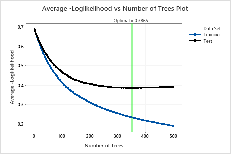
The Average –Loglikelihood vs Number of Trees Plot shows the entire curve over the number of trees grown. The optimal value for the test data is 0.3865 when the number of trees is 351.
Model Summary
| Total predictors | 13 |
|---|---|
| Important predictors | 13 |
| Number of trees grown | 500 |
| Optimal number of trees | 351 |
| Statistics | Training | Test |
|---|---|---|
| Average -loglikelihood | 0.2341 | 0.3865 |
| Area under ROC curve | 0.9825 | 0.9089 |
| 95% CI | (0.9706, 0.9945) | (0.8757, 0.9421) |
| Lift | 2.1799 | 2.1087 |
| Misclassification rate | 0.0759 | 0.1750 |
Model Summary
| Total predictors | 13 |
|---|---|
| Important predictors | 13 |
| Statistics | Out-of-Bag |
|---|---|
| Average -loglikelihood | 0.4004 |
| Area under ROC curve | 0.9028 |
| 95% CI | (0.8693, 0.9363) |
| Lift | 2.1079 |
| Misclassification rate | 0.1848 |
The Model summary table shows that the average negative loglikelihood when the number of trees is 351 is approximately 0.23 for the training data and is approximately 0.39 for the test data. These statistics indicate a similar model to what Minitab Random Forests® creates. Also, the misclassification rates are similar.
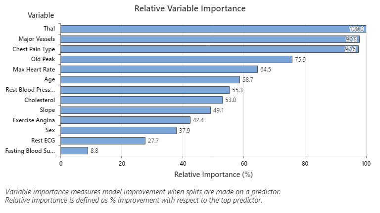
The Relative Variable Importance graph plots the predictors in order of their effect on model improvement when splits are made on a predictor over the sequence of trees. The most important predictor variable is Thal. If the contribution of the top predictor variable, Thal, is 100%, then the next important variable, Major Vessels, has a contribution of 97.8%. This means Major Vessels is 97.8% as important as Thal in this classification model.
Confusion Matrix
| Predicted Class (Training) | |||||||
|---|---|---|---|---|---|---|---|
| Predicted Class (Test) | |||||||
| Actual Class | Count | Yes | No | % Correct | Yes | No | % Correct |
| Yes (Event) | 139 | 124 | 15 | 89.21 | 110 | 29 | 79.14 |
| No | 164 | 8 | 156 | 95.12 | 24 | 140 | 85.37 |
| All | 303 | 132 | 171 | 92.41 | 134 | 169 | 82.51 |
| Statistics | Training (%) | Test (%) |
|---|---|---|
| True positive rate (sensitivity or power) | 89.21 | 79.14 |
| False positive rate (type I error) | 4.88 | 14.63 |
| False negative rate (type II error) | 10.79 | 20.86 |
| True negative rate (specificity) | 95.12 | 85.37 |
The confusion matrix shows how well the model separates the classes correctly. In this example, the probability that an event is predicted correctly is 79.14%. The probability that a nonevent is predicted correctly is 85.37%.
Misclassification
| Training | Test | ||||
|---|---|---|---|---|---|
| Actual Class | Count | Misclassed | % Error | Misclassed | % Error |
| Yes (Event) | 139 | 15 | 10.79 | 29 | 20.86 |
| No | 164 | 8 | 4.88 | 24 | 14.63 |
| All | 303 | 23 | 7.59 | 53 | 17.49 |
The misclassification rate helps indicate whether the model will predict new observations accurately. For prediction of events, the test misclassification error is 20.86%. For the prediction of nonevents, the misclassification error is 14.63% and for overall, the misclassification error is 17.49%.
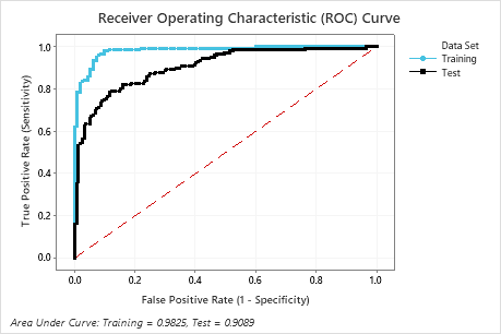
The area under the ROC curve when the number of trees is 351 is approximately 0.98 for the training data and is approximately 0.91 for the test data. This shows a nice improvement over the CART® Classification model. The Random Forests® Classification model has a test AUROC of 0.9028, so these 2 methods give similar results.
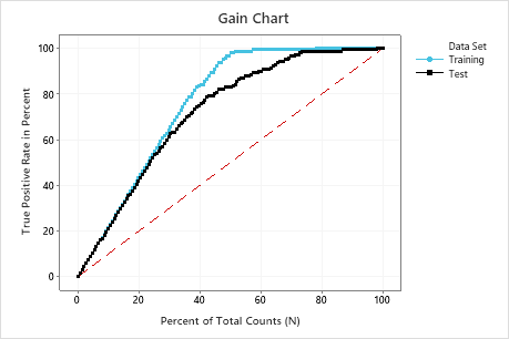
In this example, the gain chart shows a sharp increase above the reference line, then a flattening. In this case, approximately 40% of the data account for approximately 80% of the true positives. This difference is the extra gain from using the model.
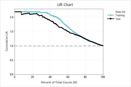
In this example, the lift chart shows a large increase above the reference line that gradually drops off.
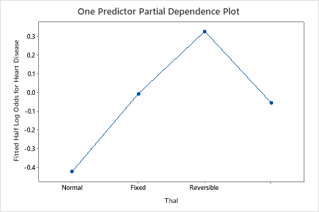
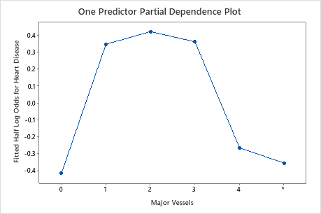
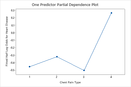
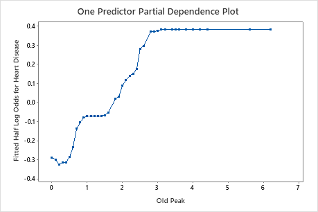
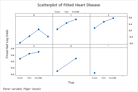
Use the partial dependency plots to gain insight into how the important variables or pairs of variables affect the fitted response values. The fitted response values are on the 1/2 log scale. The partial dependence plots show whether the relationship between the response and a variable is linear, monotonic, or more complex.
For example, in the partial dependence plot of the chest pain type, the 1/2 log odds varies, and then increases steeply. When the chest pain type is 4, the 1/2 log odds of heart disease incidence increases from approximately −0.04 to 0.03. Select or to produce plots for other variables