Use a main effects plot to examine differences between level means for one or more factors. There is a main effect when different levels of a factor affect the response differently. A main effects plot graphs the response mean for each factor level connected by a line.
When you choose Minitab creates a plot that uses data means. After you have fit a model, you can use the stored model to generate plots that use fitted means.
Example
For example, fertilizer company B is comparing the plant growth rate measured in plants treated with their product compared to plants treated by company A's fertilizer. They tested the two fertilizers in two locations. The following are the main effects plots of these two factors.
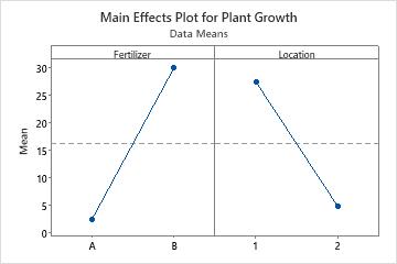
Fertilizer seems to affect the plant growth rate because the line is not horizontal. Fertilizer B has a higher plant growth rate mean than fertilizer A. Location also affects the plant growth rate. Location 1 had a higher plant growth rate mean than location 2. The reference line represents the overall mean.
- When the line is horizontal (parallel to the x-axis), then there is no main effect. Each level of the factor affects the response in the same way, and the response mean is the same across all factor levels.
- When the line is not horizontal, then there is a main effect. Different levels of the factor affect the response differently. The steeper the slope of the line, the greater the magnitude of the main effect.
Main effects plots will not show interactions. To view interactions between factors, use an interaction plot.
Important
To determine whether a pattern is statistically significant, you must do an appropriate test.