In This Topic
- Show or hide scale elements
- Transpose the y-scale and x-scale
- Do not adjust the scale with the threshold parameter
- Change the position of the major tick marks
- Change the scale range
- Change the number of minor tick marks
- Change the axis line attributes and tick orientation
- Change the tick mark labels
- Change the axis labels
- Transform a continuous scale with a logarithm or power
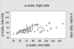
Show or hide scale elements
Graph scale elements are axis lines, axis labels, tick marks, and tick labels. You can display these elements on the high side or the low side of the graph's data region.
- Click Scale.
- On the Axes and Ticks tab, select the elements to show.
- Double-click the graph.
- Double-click the scale to open the Edit Scale dialog box.
- On the Show tab, select the elements to show.
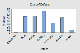
Transpose the y-scale and x-scale
For probability plots, bar charts, boxplots, interval plots, individual values plots, and histograms, you can transpose the horizontal and vertical scales.
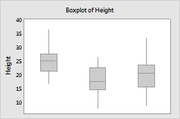
Original
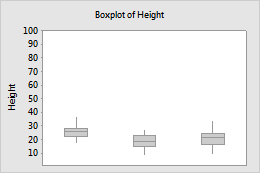
Transposed
Example of transposing the scales
In a default bar chart, the categorical scale is horizontal and the continuous scale is vertical. To emphasize the differences in the values, you can transpose the two scales.
- Click Scale.
- On the Axes and Ticks tab, select the option to transpose the scales.
- Double-click the graph.
- Double-click the scale to open the Edit Scale dialog box.
- On the Scale tab, select the option to transpose the scales.
Do not adjust the scale with the threshold parameter
- Click Scale.
- On the Axes and Ticks, deselect Adjust scale for threshold if distribution has this parameter.
- Double-click the graph.
- Double-click the scale to open the Edit Scale dialog box.
- On the Scale tab, deselect Adjust scale for threshold if distribution has this parameter.
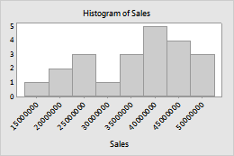
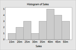
Change the position of the major tick marks
- Double-click the graph.
- Double-click the scale to open the Edit Scale dialog box.
- On the Scale tab, under Major Tick Positions, specify one of the following:
- Automatic: Display the tick marks in their default positions.
- Number of ticks: Enter the number of tick marks. Minitab spaces the tick marks evenly along the axis line. (Not available for all graphs.)
- Position of ticks: Enter the scale values at which you want major tick marks to appear. You can enter a series of numbers or specify a range of values. Use a colon between two numbers to indicate the range. Use a slash after the range to indicate an increment amount. For example, 5:30/5 places tick marks at 5, 10, 15, 20, 25, and 30.
Default tick mark positions
Custom tick mark positions
Tip
To change the bin widths for the x-scale on graphs with bins, click the Binning tab. For more information, go to Binning.
Change the scale range
- Double-click the graph.
- Double-click the scale to open the Edit Scale dialog box.
- On the Scale tab, under Scale Range, deselect Auto for Minimum or Maximum, then enter the new minimum or maximum.
Default y-scale range
Custom y-scale range
Change the number of minor tick marks
- Double-click the graph.
- Double-click the scale to open the Edit Scale dialog box.
- On the Scale tab, deselect Auto, then enter a number.
1 minor tick mark
4 minor tick marks
Note
For minor tick marks to appear on the graph, you must select them on the Show tab.
Change the axis line attributes and tick orientation
- Double-click the graph.
- Double-click the scale to open the Edit Scale dialog box.
- On the Attributes tab, specify the options.

Outside

Inside

Out and In
Change the tick mark labels
- Double-click the graph.
- Double-click the scale to open the Edit Scale dialog box.
- On the Labels tab, select Specified, then enter custom labels, separated by spaces.
Default tick mark labels
Custom tick mark labels
Edit the font for the tick mark labels on the Font tab. Change the angle of tick mark labels on the Alignment tab.
Change the axis labels
- Double-click the graph.
- Double-click the axis label to open the Edit Axis Label dialog box.
- Select the tab to make the edits that you want.
- Font: Edit the text, and the font.
- Alignment: Specify the text angle and the position relative to the default location.
- Show: Specify the location on the graph where you want the label to display.
- Double-click the graph.
- Double-click the label to open the Edit Axis Label dialog box.
- On the Text tab, deselect Auto, and enter the custom text.
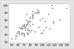
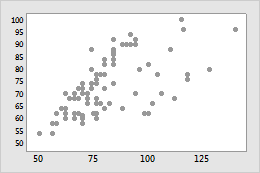
Transform a continuous scale with a logarithm or power
On a scatterplot, time series plot, and area graph, you can transform a continuous scale with a logarithm or power to get a different view of your data.
Original
Transformed
Example of transforming a scale
In the original scatterplot, the simple fitted regression line does not accurately model the curvature in the data. When the horizontal scale is transformed to logarithmic values, the simple fitted regression line accurately models the data.
- Double-click the graph.
- Double-click the axis of the continuous scale to open the Edit Scale dialog box.
- On the Transform tab, choose Logarithm or Power, and specify the parameters.