In This Topic
Step 1: Assess the fit of the distribution
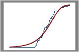
The fitted distribution line represents a distribution with parameters estimated from your sample. Assess how closely the fitted distribution line follows the stepped empirical cumulative distribution line. If the stepped line follows the fitted distribution line closely, then the data fits the distribution well.
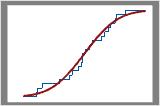
Good fit
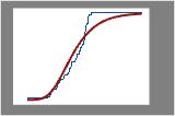
Poor fit
For a better indication of the distribution fit, use a probability plot to assess the fit for statistical significance. For information on options for fitted distribution lines, go to Fitted distribution lines.
Step 2: Display estimated percentiles for the population
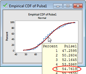
Hold your pointer over the fitted distribution line to see a chart of percentiles and values.
For example, the following empirical CDF plot shows the pulse rates of test subjects as they walked on a treadmill. For a normal distribution with a mean and standard deviation equal to the data, we would expect 5% of the population to have a pulse rate of 54.7619 or less.
Note
The estimated population percentiles are accurate only if the data follow the distribution closely.
Step 3 (optional): Display actual percentiles for the sample data
CAUTION
The actual percentiles indicate the percentage of data in your sample, not the population. Therefore, you may not be able to draw general inferences from these results, especially if the sample size is not large. The more data you have to define a percentile, the more accurately the sample percentile will represent your process.
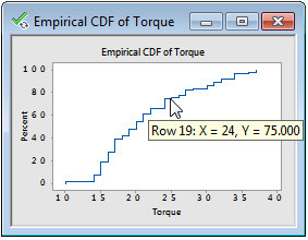
This empirical CDF plot shows the torque required to open caps of shampoo bottles. The tooltip shows that approximately 75% of the caps in the sample required a torque of 24 or less to open.
Tip
Add gridlines or reference lines to better estimate locations along the connect line. Right-click the graph and choose or .