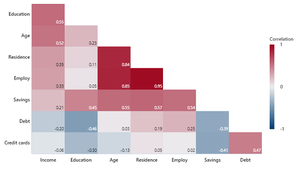
Use Correlogram to visually compare the Pearson correlation coefficients between each pair of variables. Minitab uses a color gradient to indicate low and high correlation coefficient values. You can identify the most important and least important relationships when you compare the different shades of the rectangles.
For example, a bank administrator wants to examine the strength and direction of the linear relationship between eight pieces of information from loan applicants.
Where to find this graph
To create a correlogram, choose .
When to use an alternate graph
If you want to view an array of scatterplots between each pair of variables, consider using a Matrix Plot instead.