In This Topic
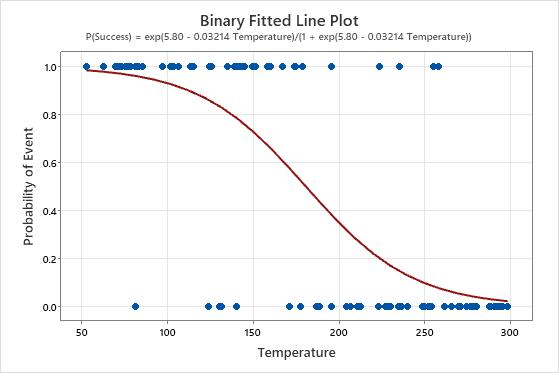
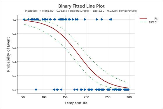
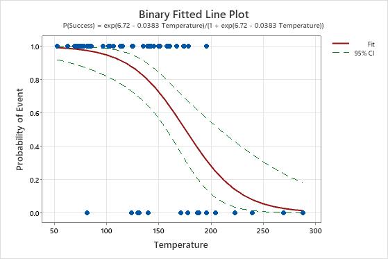
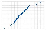
Binary fitted line plot
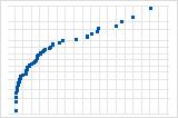
The fitted line plot displays the response and predictor data. The plot includes the regression line, which represents the regression equation. You can also choose to display the confidence interval for the fitted values.
Interpretation
Use the fitted line plot to examine the relationship between the response variable and the predictor variable.
In these results, the equation is written as the probability of a success. The response value of 1 on the y-axis represents a success. The plot shows that the probability of a success decreases as the temperature increases. When the temperatures in the data are near 50, the slope of the line is not very steep, which indicates that the probability decreases slowly as temperature increases. The line is steeper in the middle portion of the temperature data, which indicates that a change in temperature of 1 degree has a larger effect in this range. When the probability of a success approaches zero at the high end of the temperature range, the line flattens again.
If the model fits the data well, then high predicted probabilities show where the event is common. When the temperatures in the data are near 50, the response value of 1 is most common. As the temperature increases, the response value of zero becomes more common.
If you add confidence intervals to the plot, you can use the intervals to assess how precise the estimates of the fitted values are. In the first plot below, the lines for the confidence interval are approximately the same width as the predictor increases. In the second plot, the confidence interval gets wider as the value of the predictor increases. The wide interval is partly due to the small amount of data when the temperature is high.
Histogram of residuals
The histogram of the deviance residuals shows the distribution of the residuals for all observations.
Interpretation
| Pattern | What the pattern may indicate |
|---|---|
| A long tail in one direction | Skewness |
| A bar that is far away from the other bars | An outlier |
Because the appearance of a histogram depends on the number of intervals used to group the data, don't use a histogram to assess the normality of the residuals. Instead, use a normal probability plot.
Normal probability plot of residuals
The normal probability plot of the residuals displays the residuals versus their expected values when the distribution is normal.
Interpretation
Use the normal probability plot of the residuals to verify the assumption that the residuals are normally distributed. The normal probability plot of the residuals should approximately follow a straight line.
S-curve implies a distribution with long tails.

Inverted S-curve implies a distribution with short tails.
Downward curve implies a right-skewed distribution.
A few points lying away from the line implies a distribution with outliers.
If you see a nonnormal pattern, use the other residual plots to check for other problems with the model, such as missing terms or a time order effect. If the residuals do not follow a normal distribution, the normal approximation confidence intervals and Wald test p-values can be inaccurate.
Residuals versus fits
The residuals versus fits graph plots the residuals on the y-axis and the fitted values on the x-axis. The plot is meaningful when the data are in Event/Trial format. When the data are in Binary Response/Frequency format, Minitab does not provide this plot.
Interpretation
Use the residuals versus fits plot to verify the assumption that the residuals are randomly distributed. Ideally, the points should fall randomly on both sides of 0, with no recognizable patterns in the points.
| Pattern | What the pattern may indicate |
|---|---|
| Fanning or uneven spreading of residuals across fitted values | An inappropriate link function |
| Curvilinear | A missing higher-order term or an inappropriate link function |
| A point that is far away from zero | An outlier |
| A point that is far away from the other points in the x-direction | An influential point |
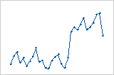
Plot with outlier
One of the points is much larger than all of the other points. Therefore, the point is an outlier. If there are too many outliers, the model may not be acceptable. You should try to identify the cause of any outlier. Correct any data entry or measurement errors. Consider removing data values that are associated with abnormal, one-time events (special causes). Then, repeat the analysis.
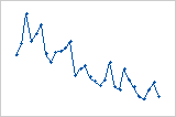
Plot with nonconstant variance
The variance of the residuals increases with the fitted values. Notice that, as the value of the fits increases, the scatter among the residuals widens. This pattern indicates that the variances of the residuals are unequal (nonconstant).
| Issue | Possible solution |
|---|---|
| Nonconstant variance | Consider using different terms in the model, a different link function, or weights. |
| An outlier or influential point |
|
Residuals versus order
The residuals versus order plot displays the residuals in the order that the data were collected.
Interpretation
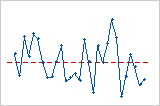
Trend
Shift
Cycle
Residuals versus the variables
The residual versus variables plot displays the residuals versus another variable. The variable could already be included in your model. Or, the variable may not be in the model, but you suspect it affects the response.
Interpretation
If you see a non-random pattern in the residuals, it indicates that the variable affects the response in a systematic way. Consider including this variable in an analysis.