Gain chart and Lift chart for CART® Classification

Use the Gain and Lift charts to assess the performance of your classification model. The Gain chart plots the total positive rate in percent versus the percent of total counts. So, for example, these charts can show that 80% of the events are in 20% of the data. Thus, by focusing on 20% of the data, we can be efficient with our resources. The Lift chart plots the cumulative lift (or non-cumulative lift) versus the percent of total counts.

Interpretation of Gain chart

The training and test lines represent the expected response using the predictive model. The training data set fits the model and the test data set evaluates the model. The dotted reference line represents a line with slope = 1, which is the expected random response without the model. Gains larger than 1 indicate that the results from the predictive model are better than random.

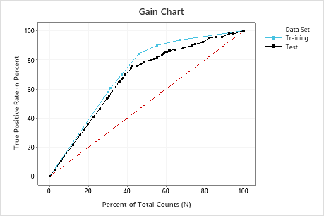
In this example, the gain chart shows a sharp increase above the reference line, then a flattening. In this case, approximately 40% of the data account for approximately 70% of the true positives.

Interpretation of Lift chart

The training and test lines represent the expected response using the predictive model. The training data set fits the model and the test data set evaluates the model. Lift is the ratio of the gain percentage relative to the expected random result. The dotted reference line represents a cumulative lift of 1, which means that there is no gain compared with random.

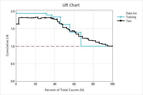
In this example, the lift chart shows an increase above the reference line that gradually drops off.