Plotted points
The plotted points on the T2 chart are the T2 values for each subgroup.
Interpretation
If the process is in control, the points fall below the upper control limit, and the process exhibits only common-cause variation. Investigate points that fall above the upper control limit. One disadvantage to multivariate charts is that the scale is unrelated to the scale of any of the variables, and out-of-control signals do not reveal which variable (or combination of variables) caused the signal.
Center line
The center line is the median of the theoretical distribution of T2 statistics.
Interpretation
Use the center line to observe how the process performs compared to the average. If the process is in control, then the points vary randomly around the center line.
Control limits
The upper control limit is the horizontal line above the center line. The upper control limit indicates whether a process is out of control, and it is based on the observed variation within subgroups and on the expected variation in the plotted points.
Decomposed T2 values
The decomposed T2 values provide the individual contribution of each variable for all out-of-control points on a T2 chart.
On a T2 chart, individual points are composite values that represent multiple variables. So a T2 chart does not show how much any one variable contributes to the combined point value, which complicates interpretation of out-of-control points. When a point is out of control on a T2 chart, you cannot determine whether all of the variables, some of the variables, or only one of the variables contributed to the out-of-control condition. However, the decomposed T2 values do indicate whether one variable contributed more to the out-of-control condition than the other variables.
Covariance matrices
A covariance matrix is a square matrix that contains the variances and covariances for several variables. The diagonal elements of the matrix contain the variances of the variables, and the off-diagonal elements contain the covariances between all possible pairs of variables.
The variance-covariance matrix is symmetric because the covariance between X and Y is the same as the covariance between Y and X. Therefore, the covariance for each pair of variables appears twice in the matrix: the covariance between the ith and jth variables is displayed at positions (i, j) and (j, i).
After you store the covariance matrices, choose to view the covariance matrices.
Interpretation
| X | Y | Z | |
| X | 2.0 | −0.86 | −0.15 |
| Y | −0.86 | 3.4 | 0.48 |
| Z | −0.15 | 0.48 | 0.82 |
The variances are displayed in bold along the diagonal. The variance of X, Y, and Z are 2.0, 3.4, and 0.82 respectively. The covariance between X and Y is −0.86, the covariance between X and Z is −0.15, and the covariance between Y and Z is 0.48.
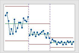
Stages
Use stages to create a historical control chart that shows how a process changes over specific periods of time. By default, Minitab recalculates the center line and control limits for each stage. For more information, go to Add stages to show how a process changed.
Interpretation
This historical control chart shows three stages of a process, which represent before, during, and after the implementation of a new procedure.