Use a pie chart to compare the proportion of data in each category. A pie chart is a circle ("pie") that is divided into segments ("slices") to represent the proportion of observations that are in each category.
To interpret a pie chart, compare groups.
- When you interpret one pie chart, look for differences in the size of the slices. The size of a slice shows the proportion of observations that are in that group.
- When you compare multiple pie charts, look for differences in the size of slices for the same categories in all the pie charts.
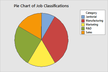
This pie chart shows the proportions of job classifications at a company. Manufacturing is the largest proportion. The proportion of Sales and Marketing jobs are about the same. Janitorial is the smallest proportion.