Step 1: Look for extreme values
Look for rectangles that have the darkest colors to determine which sets of categories have the highest values of the function you chose, which sets have the lowest, or both.
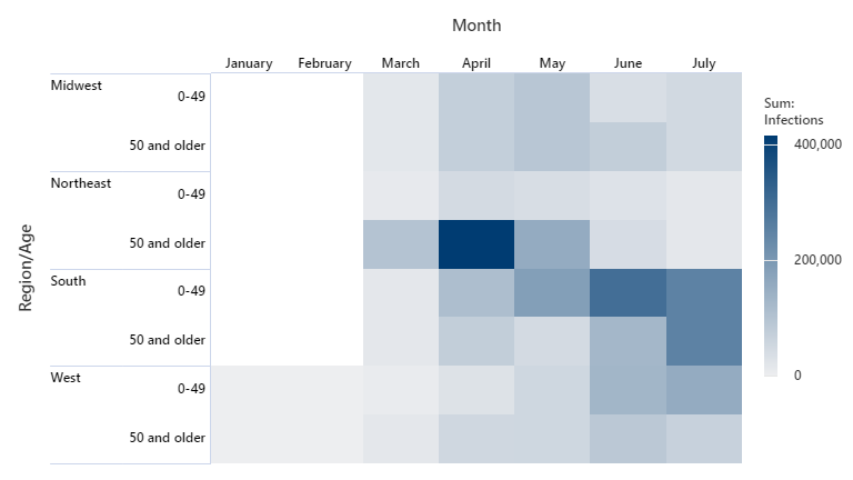
In this example, the number of infections was highest in the older population of the Northeast region in April. An epidemiologist wants to determine what factors led to such a high number of cases in that region during that time period so they can use that information to limit the spread in other regions.
Step 2: Look for patterns in your data
Depending on the type of data you have for your row variables and column variables, you might see patterns in the data. For example, a heatmap might show how a variable changes as person's age increases.
In this example, infections in the South region increased in the younger population each month from March until June. June and July have seen an increase in the South region for the older population. An epidemiologist decides that the increase in rates of the younger population might have led to an increase of cases in the older population.
In the West region, cases in the younger population increased in June and July similar to earlier months in the South region. The epidemiologist recommends that action should be taken to ensure that this does not lead to a similar increase in cases among the older population in the West region.