Use Heatmap to investigate the relationship between one or more categorical variables and a summary statistic. The summary statistic that you select, such as mean or sum, determines the color gradient for each rectangle. The color gradient is the shade that Minitab colors the rectangles. You can compare the different shades of the rectangles to determine extreme values or detect patterns.
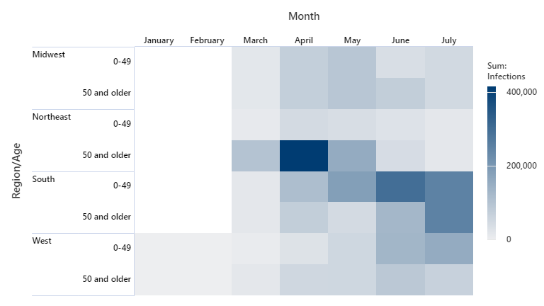
For example, an epidemiologist wants to determine how a virus spread throughout the population of four different regions.
Where to find this graph
To create a heatmap, choose .