In This Topic
- Add panels to an existing graph (Panels tab)
- Create a separate panel or a separate graph for each group (By Variables tab)
- Create a separate panel or a separate graph for each Y variable (Multiple Variables tab)
- Change fonts for panel labels
- Include Y variable names in panel labels
- Alternate tick marks between panels
- Change the arrangement of rows and columns for panels
- Change the margins between panels
Add panels to an existing graph (Panels tab)
You can divide an existing graph into separate panels for each level of a categorical variable. For example, both of these individual value plots illustrate the same data. The second plot displays separate panels for each level of Energy Source.
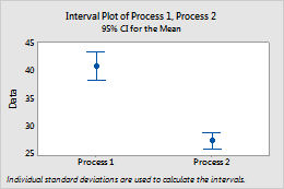
No panels
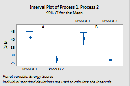
Paneled by Energy Source
- Right-click the graph and choose Panel.
- In By variables with groups in separate panels, enter a variable to specify the panels.
Create a separate panel or a separate graph for each group (By Variables tab)
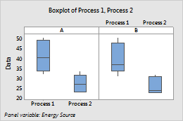
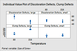
When you create the graph, you can display groups in separate panels or separate graphs. For example, in this boxplot, the data for each level of the variable, Energy Source are displayed in a separate panel.
| C1 | C2 | C3-T |
|---|---|---|
| Process 1 | Process 2 | Energy Source |
| 50 | 32 | A |
| 46 | 31 | B |
| 45 | 30 | A |
| ... | ... | ... |
When you create the graph, click Multiple Graphs. On the By Variables tab, enter the grouping variable in the appropriate box: By variables with groups in separate panels or By variables with groups on separate graphs.
Note
Do not use the same variable for paneling and for grouping in the same graph. For example, if you enter C1 in By variables with groups in separate panels, do not enter C1 in Categorical variables for grouping (1-4, outermost first).
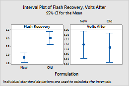
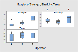
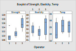
Create a separate panel or a separate graph for each Y variable (Multiple Variables tab)
When you create a graph that includes multiple Y variables, you can display each y variable in a separate panel or a separate graph. For example, the following interval plot displays each y variable Flash Recovery and Volts After in a separate panel.
| C1 | C2 | C3-T |
|---|---|---|
| Flash Recovery | Volts After | Formulation |
| 4.49 | 1.342 | Old |
| 4.89 | 1.449 | Old |
| 4.12 | 1.246 | New |
| ... | ... | ... |
Follow these steps to create a graph like this one.
- Choose the graph from the Graph menu.
-
Do one of the following:
- For a boxplot, an interval plot, or an individual value plot, select One Y, Simple or One Y, With Groups.
- For a line plot, select either of the One Y options.
- For a bar chart, select One Y, Simple, One Y, Cluster, or One Y, Stack.
- For all other graphs, choose any option.
- Enter the variables.
- Click Multiple Graphs.
- Choose In separate panels of the same graph. (To show each Y variable in a separate graph, choose On separate graphs.)
-
(Optional) To use the same range on the y-axes of each panel, select
Same Y.
Note
You can also double-click the y-axis after you create the graph, while the graph is in editing mode, and select Same scale range for all panels on the Scale tab.
Change fonts for panel labels
Note
You can also double-click the panel label after you create the graph, while the graph is in editing mode, and change options on the Font tab.
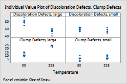
Include Y variable names in panel labels
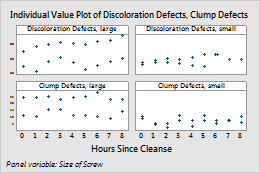
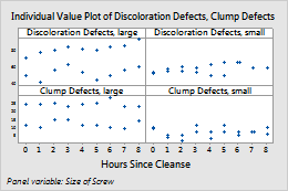
By default, when you panel by Y variables, Minitab displays the variable names in the panel labels. To remove the variable names, click the Options tab and deselect Graph variable name. For example, the panel labels for the first boxplot include the Y variable names, Discoloration Defects and Clump Defects. The panel labels for the second boxplot do not include the Y variable names.
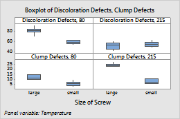
Graph variable name selected (default)
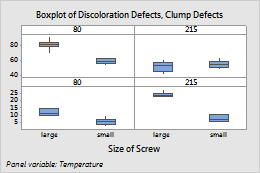
Graph variable name not selected
Alternate tick marks between panels
By default, Minitab displays tick marks on the opposite sides of adjacent panels. To display tick marks on the same side for every panel, click the Options tab, and choose Don’t alternate panels.
Alternate panels (default)
Don’t alternate panels
Change the arrangement of rows and columns for panels
To change the number of rows and columns, click the Arrangement tab, choose Custom, then specify the number of rows and columns.
3 columns, 2 rows
2 columns, 3 rows
Change the margins between panels
To change the gap between panels, click the Arrangement tab and change the number in Margins between panels.
Margin = 0