On a bubble plot, Minitab displays a bubble for each observation. The position of the bubble represents x and y. The size of the bubble represents another variable.
The following bubble plot shows the Combined MPG vs the Total Volume for automobiles at a dealership. The bubble size represents the retail price. 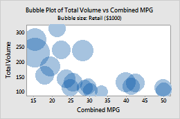
You can edit bubbles when your graph is in editing mode.
- Double-click the graph.
- Select and double-click the bubbles that you want to edit. For more information on selecting bubbles, go to Select groups and single items on a graph.
- After you select the bubbles to edit, do any of the following options:
- Select the bubble size
- On the Attributes tab, you can change how Minitab determines the size of each bubble. Select one of the following:
- Minitab calculates the sizes: Minitab scales the area of all bubbles in proportion to the largest value of the bubble size variable. For example, suppose the bubble size column contains the values 1, 2, and 3. If you change the 3 to 30, you reduce the size of the other bubbles. Enter the Maximum bubble size to proportionally increase or decrease the area of all bubbles in a plot.
- Bubble size variable contains the sizes: Minitab uses the bubble size variable to determine the radius of each bubble. The radius, rather than the area of each bubble, is a linear function of the bubble size variable. Bubble sizes do not depend on the largest value. For example, suppose the bubble size column contains the values 1, 2, and 3. If you change the 3 to 30, you do not change the size of the other bubbles. The maximum bubble radius is 100.
- Change the bubble color
- On the Attributes tab, you can also change the bubble color. Select Custom, and then select a bubble color.
- Use jitter to reveal overlapping data
- If you have identical data values on your graph, these data points can hide behind each other. Jitter randomly nudges each point to help reduce overlap. Because jitter is random, the position of each point is slightly different each time you recreate the same graph. To add jitter to the graph, on the Jitter tab, select Add jitter to direction. To adjust the amount of jitter, enter different values.