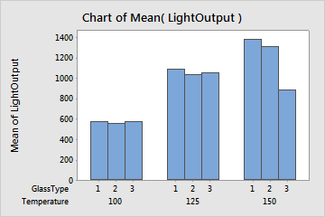
An electronics design engineer studies the effect of operating temperature and three types of face-plate glass on the light output of an oscilloscope tube. As part of the initial investigation, the engineer creates a bar chart to compare the light output of various combinations of temperature and glass type.
- Open the sample data, LightOutput.MWX.
- Choose .
- From Function, select Mean.
- In Graph variables, enter LightOutput.
- In Categorical variables for grouping (1-4, outermost first), enter Temperature and GlassType.
- Click OK.
Interpret the results
The temperature that produces the highest light output most often is 150 degrees. Although the difference in light output between glass types is small, the glass type that produces the highest light output most often is glass type 1. Overall, the highest light output occurs with glass type 1 at 150 degrees.