In This Topic
Plotted points on a tabular CUSUM
The plotted points on an tabular CUSUM chart are the cumulative sums (CUSUMs) of the deviations of each sample value from the target value.
Interpretation
- Upward or downward trends in the upper and lower CUSUMs. The plotted points should fluctuate randomly around zero. If an upward or downward trend develops, the process mean has shifted and the process may be affected by special causes.
- Plotted points that are located beyond the control limits, which indicates that the process is out of control.
Center line for tabular CUSUM
The center line on a tabular CUSUM chart is located at zero.
Control limits for tabular CUSUM
CAUTION
Do not confuse control limits with specification limits. Specification limits represent customer requirements and indicate the amount of variation that you want to see in the process. Control limits represent the actual amount of variation that is in the sample data. A process can be in control, yet not be capable of meeting specifications.
Plotted points for V-mask CUSUM
The plotted points on a V-mask CUSUM chart are the cumulative sum of deviations of the sample values from the target.
Interpretation
- Upward or downward trends in the CUSUMs. If an upward or downward trend develops, the process mean has shifted and the process may be affected by special causes.
- Plotted points that are located beyond the V-mask, which indicates that the process is out of control.
V-mask for V-mask CUSUM
Use the V-mask to assess the process on a V-mask CUSUM chart. The V-mask standardizes the deviations from the target value, and plots the deviations from this value. Center the V-mask on the observation of interest, often the most recent subgroup.
Interpretation
If the plotted points fall within the arms of the V, then you can assume that the process is in statistical control.
Standard deviation
The standard deviation measures the overall variability in the data. Minitab does not display the standard deviation on the chart, but uses it to calculate the center line and the control limits. To store the standard deviation in the worksheet, select it on the Storage tab of the Options dialog box.
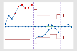
Stages
Use stages to create a historical control chart that shows how a process changes over specific periods of time. By default, Minitab recalculates the center line and control limits for each stage. For more information, go to Add stages to show how a process changed.
Interpretation
This historical control chart shows three stages of a process, which represent before, during, and after the implementation of a new procedure.