An inspector for a clothing manufacturer investigates sources of clothing defects to prioritize improvement projects. The inspector tracks the number and type of defects in the process.
An engineer creates a Pareto chart to prioritize the defects that the inspector found.
- Open the sample data, ClothingDefect.MWX.
- Choose .
- In Defects or attribute data in, enter Defect.
- In Frequencies in, enter Count.
- Select Combine remaining defects into one category after this percent, and enter 95.
- Click OK.
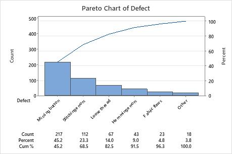
Interpret the results
In this example, 45.2% of the defects are missing buttons and 23.3% are stitching errors. The cumulative percentage for missing buttons and stitching errors is 68.5%. Thus, the largest improvement to the entire clothing process might be achieved by solving the missing button and stitching problems.