The ratio of observed variation to expected variation compares the variation in your data to the variation that you would expect based on a binomial distribution. The ratio is expressed as a percentage.
- If the ratio is greater than the upper confidence limit, then your data exhibit significant overdispersion.
- If the ratio is less than the lower confidence limit, then your data exhibit significant underdispersion.
Overdispersion can cause a traditional P chart to show an increased number of points outside the control limits. Underdispersion can cause a traditional P chart to show too few points outside of the control limits. The Laney P' chart adjusts for these conditions.
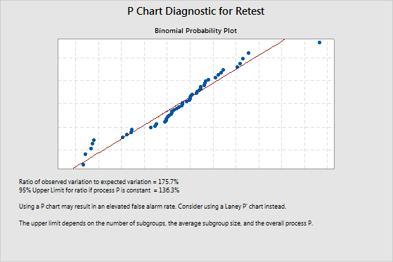
Example of overdispersion
The ratio of observed variation to expected variation is 175.7%. This value indicates overdispersion because it is greater than the upper confidence limit of 136.6%. Overdispersion can cause points on a traditional P chart to appear to be out of control when they are not. To adjust for overdispersion, use a Laney P' chart.
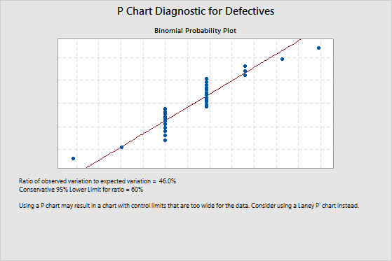
Example of underdispersion
The ratio of observed variation to expected variation is 46%. This value indicates underdispersion because it is less than the lower confidence limit of 60%. Underdispersion can cause the control limits on a traditional P chart to be too wide. If the control limits are too wide, you can overlook special-cause variation and mistake it for common-cause variation. To adjust for underdispersion, use a Laney P' chart.