or
Specify the data for your graph. In Series, enter multiple columns of time-ordered numeric or date/time data that you want to graph.
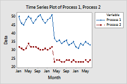
For example, in the following worksheet, Process 1 and Process 2 are the series. The graph shows the monthly energy costs for each process.
| C1 | C2 |
|---|---|
| Process 1 | Process 2 |
| 50 | 32 |
| 46 | 31 |
| 45 | 30 |
| ... | ... |