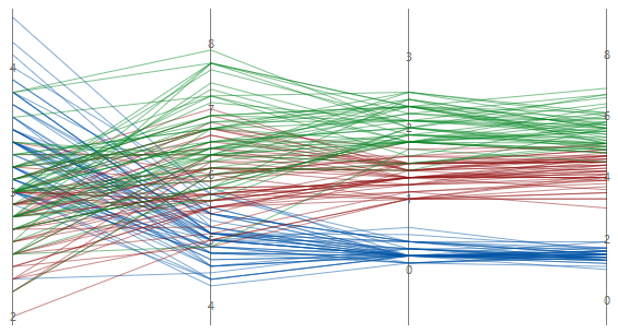
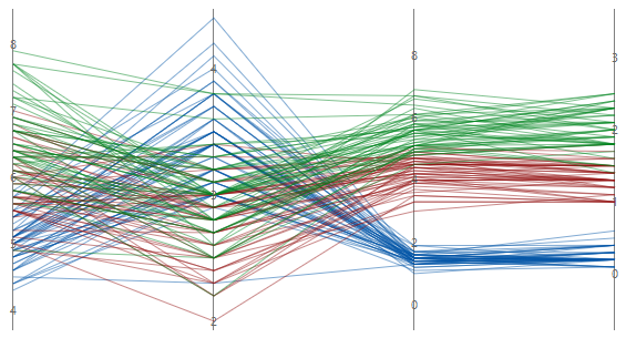
For information about data considerations, examples, and interpretation, go to Overview for Parallel Coordinates Plot.
Variables
Enter at least two columns of numeric data. Enter at least two columns of numeric or date/time data.
Row labels
Enter a column that contains labels for each series. Minitab uses this column to label a series on the plot when you hover over it with your cursor. If you don't enter a Group variable Minitab uses the label column to create a legend for the parallel plot.
Layout
Choose one of the following layout options.
- Individual series
- Creates a parallel plot that displays a series for every row in the worksheet. The worksheet must include at least two columns of numeric data.
- Individual series by group
- Creates a parallel plot that displays a series for every row in the worksheet and uses the same color for each level of the grouping variable. The worksheet must include at least two columns of numeric data and one column that contains the groups.
- Summarized groups
- Creates a parallel plot that displays the mean of each series for every group in the worksheet, not every row. The worksheet must include at least two columns of numeric data and one column that contains the groups.
Group variable
Enter a variable that defines the groups. Group labels are shown in the graph legend. You must enter a column when you select Individual series by group or Summarized groups.
By variables
- Show all combinations
-
When you enter multiple By variables, Minitab enables the Show all combinations checkbox. Select this option to create a separate parallel coordinates plot for each combination of groups created by the By variables. If you do not select this option, Minitab creates a plot for each group of each By variable.
For example, the first By variable has 2 groups, Male and Female, and the second By variable has 2 groups, Employed and Unemployed. If you select Show all combinations, Minitab creates 4 separate plots for the combinations of Male/Employed, Male/Unemployed, Female/Employed, and Female/Unemployed. If you do not select Show all combinations, Minitab creates 4 separate plots for Male, Female, Employed, and Unemployed.
Y-scale
Select how you want to display the y-scale.
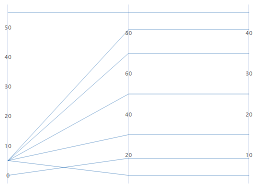
Percent of range
Select to plot each variable with a unique y-scale. A series that contains all of the minimum or maximum values for each variable will be a horizontal line.
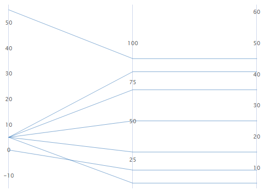
Standard units
Select to plot each variable with a unique y-scale. The minimum and maximum values for each scale are the overall minimum and maximum z-score values from all the data that you entered converted to each variable's scale.
For example, the first variable's maximum value has a z-score of 2, while the other two variable's maximum value has a z-score of 1. The maximum value for each variable's y-scale is the value that corresponds to a z-score of 2.
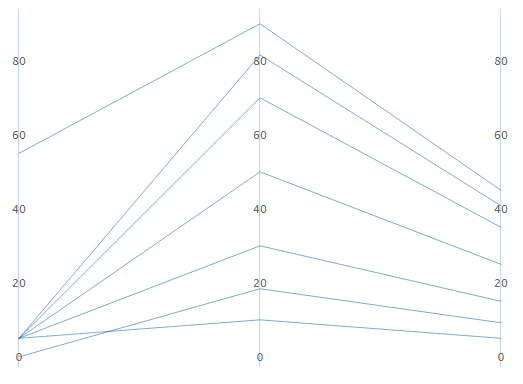
Original data
Select to use a single y-scale that is repeated for each variable. The minimum and maximum values for the scale are the overall minimum and maximum values from all the data that you entered.
Sort variables from greatest to least variation in lines
If you select Standard units or Original data, you can sort the variables based on the variation. This can be useful when you have many variables and you want to see which one separates the series the most. If you do not select this option, Minitab sorts the columns in the same order as you enter them in the Variables dialog box.
Unsorted