Note
This command is available with the Predictive Analytics Module. Click here for more information about how to activate the module.
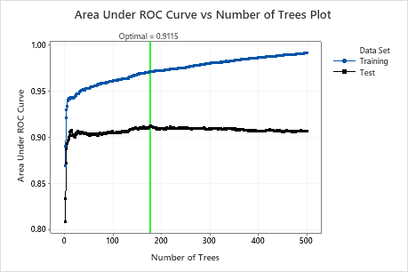
The Area Under ROC Curve vs Number of Trees Plot displays the area under the ROC curve on the y-axis and the number of trees on the x-axis. The area under an ROC curve indicates whether the model is a good classifier. Use the test results to assess the performance of the model to predict new observations. Compare the training results and the test results to see whether there are overfitting problems with the model for the training data set.
When the maximum likelihood value determines the number of trees for the optimal model, then Minitab displays the Average-LogLikelihood vs Number of Trees plot. When the minimum misclassification rate determines the number of trees for the optimal model, then Minitab displays the Misclassification Rate vs Number of Trees plot.
Interpretation
For classification trees, the area under the ROC curve values typically range from 0.5 to 1. Larger values indicate a better classification model. When the model can perfectly separate the classes, then the area under the curve is 1. When the model cannot separate the classes better than a random assignment, then the area under the curve is 0.5.
The reference line indicates the optimal area under the ROC curve for the test data and the number of trees in the model.
Ideally, the test curve increases as number of trees increases and then reaches a maximum before leveling or decreasing in some cases. If the maximum for the test curve is not ideal, try to tune the learning rates and subsample fractions to compare.