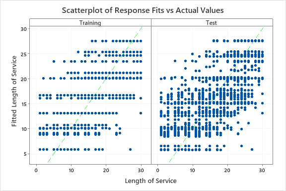
The scatterplot shows the actual response values on the x-axis and the fitted response values on the y-axis. The calculated line represents when the actual value and the response value are equal. Outliers or unusual clusters of points in the test data can indicate data that deserve more investigation.
Interpretation
Ideally, the line goes through the middle of the points and the points are close to the line, relative to the scale of the response variable. When you have use a validation technique, Minitab creates separate plots for the training and test data. You can compare the plots to examine the relative performance of the tree on the training data and on new data. You can also look for different patterns that could indicate a difference to investigate between the training and test data.
In this scatterplot, the points for the training and test data sets show similar patterns. This similarity suggests that the performance of the tree on new data is close to the performance of the tree on the training data.