Researchers in a food laboratory want to enhance a recipe for cheese fondue by improving the flavor, maximizing the amount that sticks to bread dipped into the fondue, and minimizing the amount that is burned at the bottom of the pot. The researchers design an extreme vertices mixture experiment to study the effects of the mixture blend and serving temperature.
To help visualize the component effects after they fit the model with Analyze Mixture Design, the researchers create a response trace plot for the flavor rating.
- Open the sample data, FondueRecipe_model.MWX.
- Choose .
- From Response, select Flavor.
- Under Trace Direction, select Cox (proportion).
- Under Model Fitted in, select Proportions.
- Under Reference Blend, select Centroid of vertices.
- Click OK.
Interpret the results
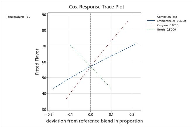
The fondue data has three components and one process variable. The process variable, temperature, is held at 80 degrees. The trace plot provides the following information about the component effects when you start at the location that corresponds to the reference blend:
- As the proportion of Emmenthaler in the mixture increases, the flavor rating increases. As the proportion decreases, the flavor rating decreases.
- As the proportion of Gruyere in the mixture increases, the flavor rating increases more rapidly than it does for Emmenthaler. As the proportion decreases, the flavor rating decreases rapidly.
- As the proportion of broth in the mixture increases, the flavor rating decreases. As the proportion decreases, the flavor rating increases.
Based on these findings, the researchers may want to increase the proportion of both Emmenthaler and Gruyere cheese, and decrease the proportion of broth in the fondue.