The main effects plot displays the means for each group within a categorical variable.
- When the line is horizontal (parallel to the x-axis), there is no main effect present. The response mean is the same across all factor levels.
- When the line is not horizontal, there is a main effect present. The response mean is not the same across all factor levels. The steeper the slope of the line, the greater the magnitude of the main effect.
Although you can use this plot to display the effects, be sure to perform the appropriate ANOVA test and evaluate the statistical significance of the effects. If the interaction effects are significant, you cannot interpret the main effects without considering the interaction effects.
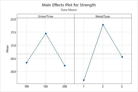
In this main effects plot, it appears that SinterTime 150 is associated with the highest mean strength. However, the general linear model results indicate that this main effect is not statistically significant. The difference may be caused by random chance.
MetalType 2 is associated with the highest mean strength, and the general linear model results indicate that this main effect is significant.
The general linear model results indicate that the interaction between SinterTime and MetalType is statistically significant. Consequently, you cannot interpret the main effects without considering the interaction effect.