In This Topic
Step 1: Determine whether the process location is in control
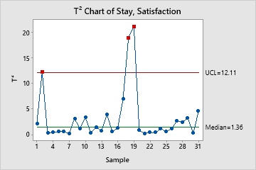
The T2 chart plots the T2 for each subgroup to measure whether the process locations of several related variables are simultaneously in control. The center line is the median of the theoretical distribution of T2 statistics. The upper control limit is based on the number of samples, the size of each sample, and the number of variables.
Red points indicate subgroups that are above the upper control limit and not in control. One disadvantage to multivariate charts is that the scale is unrelated to the scale of any of the variables, and out-of-control signals do not reveal which variable (or combination of variables) caused the signal.
In these results, three points are out of control. Subgroups 2, 18, and 19 are above the upper control limit, which indicates that special causes may currently affect the process. When you hold the pointer over a red point, you can get more information about this subgroup.
Step 2: Identify which points failed the test
Investigate any subgroups that are above the upper control limit. The output shows which points are above the upper control limit, as shown here.
Test Results for T² Chart of Stay, Satisfaction
| Point | Variable | P-Value | |
|---|---|---|---|
| Greater Than UCL | 2 | Stay | 0.0030 |
| Satisfaction | 0.0067 | ||
| 18 | Stay | 0.0010 | |
| Satisfaction | 0.0002 | ||
| 19 | Satisfaction | 0.0000 |