In This Topic
Step 1: Determine whether the proportion of defective items is in control
The Laney P' chart is similar to a traditional P chart. Both charts monitor the proportion of defective items that are produced by your process. However, if your data exhibit overdispersion or underdispersion, a Laney P' chart may more accurately distinguish between common-cause variation and special-cause variation.
Overdispersion can cause a traditional P chart to show an increased number of points outside the control limits. Underdispersion can cause a traditional P chart to show too few points outside of the control limits. The Laney P' chart adjusts for these conditions. For more information, go to Overdispersion and underdispersion.
Red points indicate subgroups that fail at least one of the tests for special causes and are not in control. If the same point fails multiple tests, then the point is labeled with the lowest test number to avoid cluttering the graph. If the chart shows out-of-control points, investigate those points.
Out-of-control points can influence the estimates of process parameters and prevent control limits from truly representing your process. If out-of-control points are due to special causes, then consider omitting these points from the calculations. For more information, go to Specify subgroups to estimate parameters for Laney P' Chart.
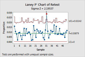
Consider the following example of a Laney P' chart. The Sigma Z value (approximately 2.2) is greater than 1, which indicates that the control limits on the Laney P' chart are wider than those on a traditional P chart to adjust for overdispersion. The proportion of defectives for subgroup 31 is out of control. When you hold the pointer over a red point, you can get more information about the subgroup. You should identify any special causes that may contribute to the unusually high proportion of defective items for that subgroup.
Step 2: Identify which points failed each test
Investigate any subgroups that fail the tests for special causes. By default, Minitab conducts only Test 1, which detects points that fall outside of the control limits. However, if you conduct additional tests, then points can fail multiple tests. The output shows exactly which points failed each test, as shown here.
These results show that subgroup 31 failed Test 1.
Test Results for Laney P′ Chart of Retest
| TEST 1. One point more than 3.00 standard deviations from center line. |
|---|
| Test Failed at points: 31 |
Note
When you use several tests at the same time, the sensitivity of the chart increases. However, the false alarm rate also increases, which can make you react to the test results unnecessarily.
For more information on each of the tests and when to use them, go to Using tests for special causes in control charts.