Use a Laney P' chart (P' is pronounced as P prime) to monitor the proportion of defective items that are produced by your process and to adjust for overdispersion or underdispersion in your data. Overdispersion can cause a traditional P chart to show an increased number of points outside the control limits. Underdispersion can cause a traditional P chart to show too few points outside of the control limits. The Laney P' chart adjusts for these conditions. For more information, go to Overdispersion and underdispersion.
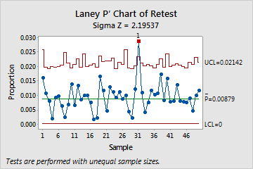
For example, the radiology department at a hospital wants to track the proportion of patients that require a retest due to imaging errors. The average number of procedures is high and the data exhibit overdispersion, so the staff use a Laney P' chart instead of a traditional P chart to monitor patient records. The chart shows that, on average, approximately 0.88% of patients require a retest. The proportion of defectives for subgroup 31 is out of control.
Where to find this control chart
To create a Laney P' chart, choose .
When to use an alternate control chart
If you can count the number of defects on each item, use U Chart, Laney U' Chart, or C Chart to plot the number of defects per unit.