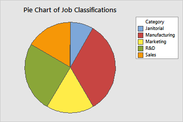
Use Pie Chart to compare the proportion of data in each category or group. A pie chart is a circle ("pie") that is divided into segments ("slices") to represent the proportion of observations that are in each category.
For example, the following pie chart shows the proportion of jobs in each category of jobs.
Where to find this graph
To create a pie chart, choose .