You can change slice order, explode slices, and change the appearance of slices.
Slices on a pie chart represent categories. By comparing the size of the slices, you can evaluate the relative magnitude of each category. For example, the following pie chart represents the counts of paint flaw types.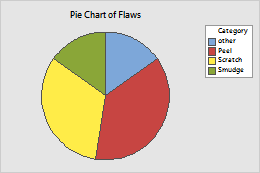
Change slice order and position
To change slice options when you create a graph, click Pie Options. To change slice options on an existing graph, use the following steps:
- Double-click the graph.
- Double-click the pie.
- On the Options tab, change the slice order and position:
- Specify the slice order
- Under Order Slices By, select one of the following options:
- Default: For counts of unique values, Minitab represents the unique values in increasing order. To change the order of values in a text column, go to Change the display order of text values in Minitab output. For values from a table, Minitab uses the order of the rows in the worksheet.
- Increasing volume: Order slices from smallest to largest.
- Decreasing volume: Order slices from largest to smallest.
- Specify the starting point
- The default Start angle is 90° (12 o'clock).
- Specify when to combine slices
- In Combine slices of this percent or less, enter a minimum percentage for separate slices. Categories less than this percentage are grouped into a slice named Other.
- Specify the diameter of the pie
- (This option is only available after you create the graph.) To change the diameter of the pie, enter a value in Pie diameter that is greater than 0 and not larger than 1.
Explode slices
After you create a pie chart, you can explode one or more slices.
- Double-click the graph.
-
Make a selection.
- To explode a single slice, select the slice.
- To explode all slices at once, select the whole pie.
Note
For more information on selection, go to Select groups and single items on a graph.
- With your selection, right-click the graph and choose Edit Pie.
- On the Explode tab, specify the Explode length.
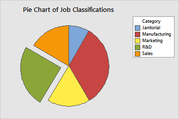
For example, the explode length for the R&D slice in this pie chart is 1 (the maximum). The explode length for the remaining slices is 0.
Change the appearance of slices
After you create a pie chart, you can change the color and type of fill pattern, borders, and fill lines for one or more slices.
- Double-click the graph.
- Make a selection.
- To explode a single slice, select the slice.
- To explode all slices at once, select the whole pie.
Note
For more information on selection, go to Select groups and single items on a graph.
- With your selection, right-click the graph and choose Edit Pie.
- On the Attributes tab, specify the options.