Use Binned Scatterplot to investigate the relationship between a pair of continuous variables when the data set contains many observations.
A scatterplot displays ordered pairs of x- and y- variables in a coordinate plane. With large data sets, the points in a scatterplot can overlap and make it difficult to assess the distribution of the data. A binned scatterplot groups the data into rectangular bins. Minitab uses the colors of the bins to display either the density of the bins or the mean of a third variable.
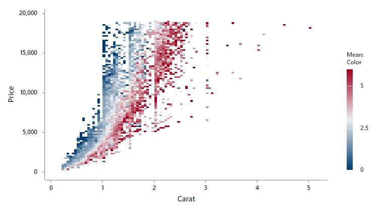
For example, a research team for a large jewelry retailer investigates the relationship between carat, color, and price of more than 53,000 diamonds.
Where to find this graph
To create a binned scatterplot, choose .