Complete the following steps to specify the data for your graph.
- From Function, select the function of the graph variable that you want to graph.
- In Graph variables, enter one or more columns of numeric or date/time data that you want to graph. By default, Minitab creates a separate graph for each variable.
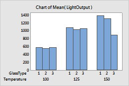
- In Categorical variables for grouping (1-4, outermost first), enter two to four columns of categorical data that define the groups. The first variable is the outermost on the scale and the last variable is the innermost. In the graph below, Temperature is the outermost categorical variable.
In this worksheet, LightOutput is the graph variable, and Temperature and GlassType are the categorical variables. The graph shows the mean of the light output for each glass type, clustered by temperature.
| C1 | C2 | C3 |
|---|---|---|
| LightOutput | Temperature | GlassType |
| 580 | 100 | 1 |
| 1090 | 125 | 1 |
| 1392 | 150 | 1 |
| ... | ... | ... |