Use to visually identify the feasible variables for multiple responses for a model. Feasible variable settings for one response might be far from feasible for a different response. You can use overlaid contour plots to consider the responses at the same time.
When you create an overlaid contour plot, you specify a lower and upper bound for each response. The overlaid contour plot displays contours for these bounds vs. two (or three for mixtures) continuous factors on the axes. The other variables in a model are held at user-specified settings.
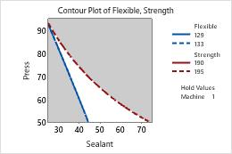
The contour line is a curve that connects plot points such that the fitted response values are equal. For example, with a lower bound of 30, the contour for the lower bound would be a curve connecting the points on the plot with fitted response values equal to 30.
The plot emphasizes the region (if any) where all responses are within their bounds. This is known as the feasible region.
For example, your company injection-molds a plastic part that must obtain certain levels of both strength and flexibility. You would like to determine the range of sealants and pressures that will give the plastic the strength and flexibility required. Draw an overlaid contour plot with sealant and pressure on the x- and y-axes and flexibility and strength represented by contours.