Compare the results for each series or Y variable
Compare the results for each series or Y variable to see if they have the same general shape and direction. Investigate any differences to determine their cause. If the Y variables have a common target value that is desirable, use the plot to help determine the levels of the X variable that best satisfy the goal. If the series have an ideal profile, compare the series to see which ones best approximate ideal performance.
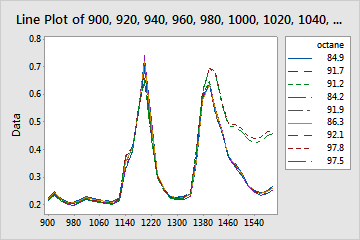
This line plot shows similar chromatogram profiles for samples of gasoline at various octanes. Sharp peaks occur for all octane levels at x-axis values of approximately 1200 and 1400. This suggests consistency among the samples of different octane fuels. However, two levels of octane show a less sudden decrease in response values than the other octane levels after the second peak.
Note
If the data were collected over equally spaced intervals of time, and you recorded the data in the worksheet in time order (in the order of collection), then the line plot is similar to a time series plot with multiple variables. For more information on interpreting trends, cycles, and other patterns in a time series plot, go to Interpret the key results for Time Series Plot.