In This Topic
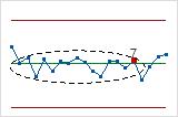
Xbar Chart
The Xbar chart plots the average of the measurements within each subgroup. The center line is the average of all subgroup averages. The control limits, which are set at a distance of 3 standard deviations above and below the center line, show the amount of variation that is expected in the subgroup averages.
Minitab displays an Xbar chart when your subgroup size is greater than 1.
Interpretation
Use an Xbar chart to monitor the mean of a process and determine whether it is stable enough to perform capability analysis.
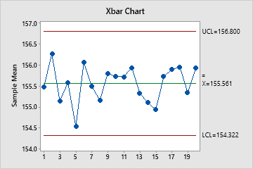
In these results, the points vary randomly around the center line and are within the control limits. No trends or patterns are present. The process center is stable enough to perform capability analysis.
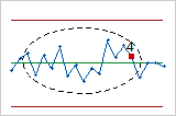
I Chart
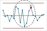
The I chart plots individual observations. The center line is an estimate of the process average. The control limits, which are set at a distance of 3 standard deviations above and below the center line, show the amount of variation that is expected in the individual sample values.
Minitab displays an I chart when your subgroup size is 1.
Interpretation
Use an I chart to assess whether the individual measurements are in control and determine whether the process is stable enough to perform capability analysis.
Red points indicate observations that fail at least one of the tests for special causes and are not in control. Out-of-control points indicate that the process may not be stable and that the results of a capability analysis may not be reliable. You should identify the cause of out-of-control points and eliminate special-cause variation before you analyze process capability.
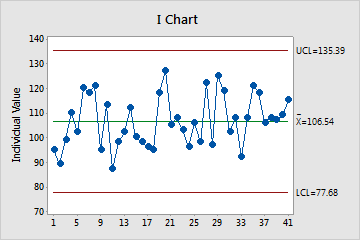
In this chart, the points vary randomly around the center line and are within the control limits. No trends or patterns are present. The process center is stable enough to perform capability analysis.
R Chart
The R chart plots the subgroup ranges. If the subgroup size is constant, then the center line is the average of all subgroup ranges. If the subgroup sizes differ, then the value of the center line depends on the subgroup size, because larger subgroups tend to have larger ranges. The control limits, which are set at a distance of 3 standard deviations above and below the center line, show the amount of variation that is expected in the subgroup ranges.
Minitab displays an R chart to monitor variation if your subgroup size is greater than 2 but less than 9.
Interpretation
Use an R chart to monitor the variation of a process and determine whether it is stable enough to perform capability analysis. The R chart indicates whether the subgroup-to-subgroup variation is in control.
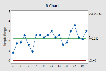
In these results, the points vary randomly around the center line and are within the control limits. No trends or patterns are present. The process variation is stable enough to perform capability analysis.
S Chart
The S chart plots the subgroup standard deviations. The center line is the average of all subgroup standard deviations. The control limits, which are set at a distance of 3 standard deviations above and below the center line, show the amount of variation that is expected in the subgroup standard deviations.
Minitab displays an S chart to monitor variation if your subgroup size is greater than or equal to 9.
Interpretation
Use an S chart to monitor the variation (standard deviation) of your process and determine whether it is stable enough to perform capability analysis. The S chart indicates whether the subgroup-to-subgroup variation is in control.
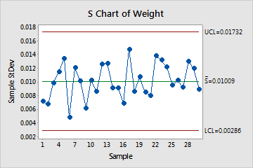
In these results, the points vary randomly around the center line and are within the control limits. No trends or patterns are present. The variation of the process is stable enough to perform capability analysis.
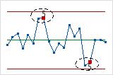
Moving Range (MR) Chart
The MR chart plots the moving ranges for consecutive observations. The center line is the average of all moving ranges. The control limits, which are set at a distance of 3 standard deviations above and below the center line, show the amount of variation that is expected in the moving ranges.
Minitab displays an MR chart If your subgroup size is 1.
Interpretation
Use an MR chart to monitor the variation (moving range) of your process and to determine whether it is stable enough to perform capability analysis. The MR chart indicates whether the variation from observation to observation is in control.
Red points indicate observations that fail at least one of the tests for special causes and are not in control. Out-of-control points indicate that the process may not be stable and that the results of a capability analysis may not be reliable. You should identify the cause of out-of-control points and eliminate special-cause variation before you analyze process capability.
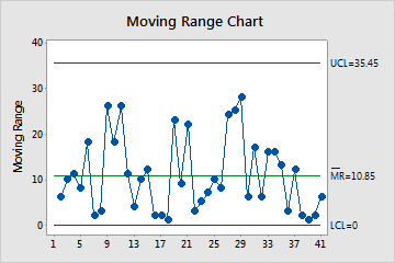
In these results, the points vary randomly around the center line and are within the control limits. No trends or patterns are present. The variation of the process is stable enough to perform capability analysis.
Tests for special causes
The tests for special causes assess whether the plotted points on each control chart are randomly distributed within the control limits.
Interpretation
Use the tests for special causes to determine which observations you may need to investigate and to identify specific patterns and trends in your data. Each of the tests for special causes detects a specific pattern or trend in your data, which reveals a different aspect of process instability.
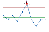
- One point more than 3 standard deviations from center line
- Test 1 identifies subgroups that are unusual compared to other subgroups. Test 1 is
universally recognized as necessary for detecting out-of-control
situations. If small shifts in the process are of interest, you can use
Test 2 to supplement Test 1 in order to create a control chart that has
greater sensitivity.
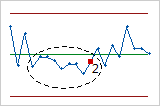
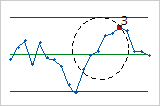
- Nine points in a row on same side of center line
- Test 2 identifies shifts in the process centering or variation. If small shifts in the
process are of interest, you can use Test 2 to supplement Test 1 in
order to create a control chart that has greater sensitivity.
- Six points in a row, all increasing or all decreasing
- Test 3 detects trends. This test looks for long series of consecutive points that
consistently increase in value or decrease in value.
- Fourteen points in a row, alternating up and down
- Test 4 detects systematic variation. You want the pattern of variation in a process to be
random, but a point that fails Test 4 might indicate that the pattern of
variation is predictable.
- Two out of three points more than 2 standard deviations from center line (same side)
- Test 5 detects small shifts in the process.
- Four out of five points more than 1 standard deviation from center line (same side)
- Test 6 detects small shifts in the process.
- Fifteen points in a row within 1 standard deviation of center line (either side)
- Test 7 detects a pattern of variation that is sometimes mistaken as evidence of good
control. This test detects control limits that are too wide. Control
limits that are too wide are often caused by stratified data, which
occur when a systematic source of variation is present within each
subgroup.
- Eight points in a row more than 1 standard deviation from center line (either side)
- Test 8 detects a mixture pattern. In a mixture pattern, the points tend to fall away from
the center line and instead fall near the control limits.
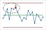
Last 25 Subgroups plot
The Last 25 Subgroups plot shows the data points for each of the last 25 subgroups and displays a line for the overall process mean.
Interpretation
Use the Last 25 Subgroups plot to evaluate whether the distribution of the observations within the subgroups meets the requirements for your capability analysis.
- A subgroup that contains outliers
- Data that are not symmetrically distributed around the process mean
- Distribution changes across subgroups
If the plot shows evidence of problems or changes across subgroups, the capability results may not be valid. Investigate your process to determine why the data values are not distributed randomly across the subgroups.
In this plot, the points appear to be randomly and symmetrically distributed around the process mean.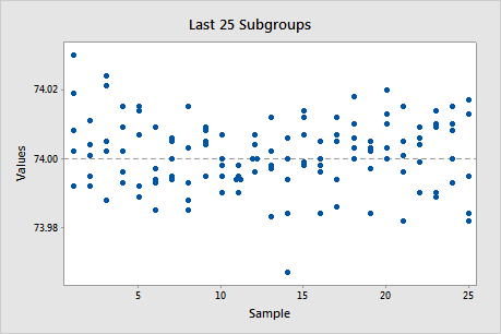
Note
If the subgroup size is 1, Minitab displays a Last 25 Observations plot, which is interpreted similarly.
Capability Histogram
The capability histogram shows the distribution of your sample data. Each bar on the histogram represents the frequency of data within an interval.
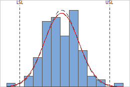 The within and overall curves on the histogram are normal distribution curves that are generated using the process mean and different estimates of process variation. The dashed within curve uses the within-subgroup standard deviation. The solid overall curve uses the overall standard deviation.
 Interpretation
Use the capability histogram to visualize your sample data in relation to the distribution fit and the specification limits.
To visually assess the distribution fit, compare the bars in the histogram with the curved fit line. The shape of the data in the histogram should approximately match the curve. To ascertain whether the data follow the distribution, use the results in the probability plot.
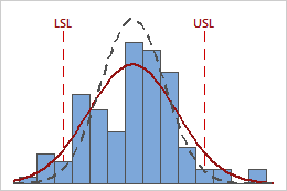
In these results, the process data appear fairly centered between the specification limits. However, the process spread is larger than the specification spread, which suggests poor capability. Although most of the data are within the specification limits, there are nonconforming parts below the lower specification limit (LSL) and above the upper specification limit (USL).
Note
To determine the number of nonconforming items in your process, use the overall PPM result.
Normal Probability Plot
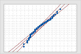
- Middle line
- The expected percentile from the distribution based on maximum likelihood parameter estimates.
- Confidence bound lines
- The left curved line indicates the lower bounds of the confidence intervals for the percentiles. The right curved line indicates the upper bounds of the confidence intervals for the percentiles.
- Anderson-Darling test statistic and p-value
- The results of a test to determine whether your data follow the distribution.
Interpretation
Use the normal probability plot to assess the requirement that your data follow a normal distribution.
If the normal distribution is a good fit for the data, the points form an approximately straight line and fall along the fitted line that is located between the confidence bounds. Departures from this straight line indicate departures from normality. If the p-value is greater than 0.05, you can assume that the data follow the normal distribution. You can evaluate the capability of your process using a normal distribution.
If the p-value is less than 0.05, your data are not normal and the capability analysis results may not be accurate. Use Individual Distribution Identification to determine whether you must transform the data or fit a nonnormal distribution to perform the capability analysis.
Capability Plot
The capability plot is located at the lower right corner of the Normal Capability Sixpack Report.
The capability plot consists of three intervals:
- The within interval represents the potential process tolerance and is calculated by six times the within-subgroup standard deviation.
- The overall interval represents the actual process tolerance and is calculated by six times the overall standard deviation.
- The specification interval represents the interval between the lower and upper specification limits (LSL and USL.
The process center is shown by the tick mark inside the Overall and Within process spread intervals. The target, if you have one, is shown by the tick mark inside the specification spread (Specs).
Interpretation
Use the capability plot to visually assess the capability of your process.
To assess the potential capability of your process, compare the within process spread with the specification spread. To assess the overall capability of your process, compare the overall process spread with the specification spread. If the process spread is greater than the specification spread, your process needs improvement.
Compare the process center to the target, if you have one. If the process is centered (on target), the middle tick marks for the specifications and for the process spread are vertically aligned. If the process is not centered, investigate the reasons why.
If the within process spread and the overall process spread differ greatly, your process may not be stable. Check the control charts to ensure that your process is in control.