In This Topic
Eigenvalue
Eigenvalues (also called characteristic values or latent roots) are the variances of the principal components.
Interpretation
You can use the size of the eigenvalue to determine the number of principal components. Retain the principal components with the largest eigenvalues. For example, using the Kaiser criterion, you use only the principal components with eigenvalues that are greater than 1.
To visually compare the size of the eigenvalues, use the scree plot. The scree plot can help you determine the number of components based on the size of the eigenvalues.
Eigenanalysis of the Correlation Matrix
| Eigenvalue | 3.5476 | 2.1320 | 1.0447 | 0.5315 | 0.4112 | 0.1665 | 0.1254 | 0.0411 |
|---|---|---|---|---|---|---|---|---|
| Proportion | 0.443 | 0.266 | 0.131 | 0.066 | 0.051 | 0.021 | 0.016 | 0.005 |
| Cumulative | 0.443 | 0.710 | 0.841 | 0.907 | 0.958 | 0.979 | 0.995 | 1.000 |
Eigenvectors
| Variable | PC1 | PC2 | PC3 | PC4 | PC5 | PC6 | PC7 | PC8 |
|---|---|---|---|---|---|---|---|---|
| Income | 0.314 | 0.145 | -0.676 | -0.347 | -0.241 | 0.494 | 0.018 | -0.030 |
| Education | 0.237 | 0.444 | -0.401 | 0.240 | 0.622 | -0.357 | 0.103 | 0.057 |
| Age | 0.484 | -0.135 | -0.004 | -0.212 | -0.175 | -0.487 | -0.657 | -0.052 |
| Residence | 0.466 | -0.277 | 0.091 | 0.116 | -0.035 | -0.085 | 0.487 | -0.662 |
| Employ | 0.459 | -0.304 | 0.122 | -0.017 | -0.014 | -0.023 | 0.368 | 0.739 |
| Savings | 0.404 | 0.219 | 0.366 | 0.436 | 0.143 | 0.568 | -0.348 | -0.017 |
| Debt | -0.067 | -0.585 | -0.078 | -0.281 | 0.681 | 0.245 | -0.196 | -0.075 |
| Credit cards | -0.123 | -0.452 | -0.468 | 0.703 | -0.195 | -0.022 | -0.158 | 0.058 |
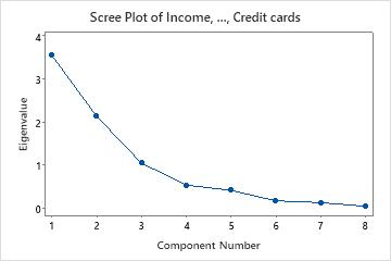
In these results, the first three principal components have eigenvalues greater than 1. These three components explain 84.1% of the variation in the data. The scree plot shows that the eigenvalues start to form a straight line after the third principal component. If 84.1% is an adequate amount of variation explained in the data, then you should use the first three principal components.
Proportion
Proportion is the proportion of the variability in the data that each principal component explains.
Interpretation
You can use the proportion to determine which principal components explain most of the variability in the data. The higher the proportion, the more variability that the principal component explains. The size of the proportion can help you decide whether the principal component is important enough to retain.
For example, a principal component with a proportion of 0.621 explains 62.1% of the variability in the data. Therefore, this component is important to include. Another component has a proportion of 0.005, and thus explains only 0.5% of the variability in the data. This component may not be important enough to include.
Cumulative
Cumulative is the cumulative proportion of the sample variability explained by consecutive principal components.
Interpretation
Use the cumulative proportion to assess the total amount of variance that the consecutive principal components explain. The cumulative proportion can help you determine the number of principal components to use. Retain the principal components that explain an acceptable level of variance. The acceptable level depends on your application.
For example, you may only need 80% of the variance explained by the principal components if you are only using them for descriptive purposes. However, if you want to perform other analyses on the data, you may want to have at least 90% of the variance explained by the principal components.
Principal components (PC)
Note
If you use the correlation matrix, you must standardize the variables to obtain the correct component score.
Interpretation
To interpret each principal component, examine the magnitude and the direction of coefficients of the original variables. The larger the absolute value of the coefficient, the more important the corresponding variable is in calculating the component. How large the absolute value of a coefficient has to be in order to deem it important is subjective. Use your specialized knowledge to determine at what level the correlation value is important.
Eigenanalysis of the Correlation Matrix
| Eigenvalue | 3.5476 | 2.1320 | 1.0447 | 0.5315 | 0.4112 | 0.1665 | 0.1254 | 0.0411 |
|---|---|---|---|---|---|---|---|---|
| Proportion | 0.443 | 0.266 | 0.131 | 0.066 | 0.051 | 0.021 | 0.016 | 0.005 |
| Cumulative | 0.443 | 0.710 | 0.841 | 0.907 | 0.958 | 0.979 | 0.995 | 1.000 |
Eigenvectors
| Variable | PC1 | PC2 | PC3 | PC4 | PC5 | PC6 | PC7 | PC8 |
|---|---|---|---|---|---|---|---|---|
| Income | 0.314 | 0.145 | -0.676 | -0.347 | -0.241 | 0.494 | 0.018 | -0.030 |
| Education | 0.237 | 0.444 | -0.401 | 0.240 | 0.622 | -0.357 | 0.103 | 0.057 |
| Age | 0.484 | -0.135 | -0.004 | -0.212 | -0.175 | -0.487 | -0.657 | -0.052 |
| Residence | 0.466 | -0.277 | 0.091 | 0.116 | -0.035 | -0.085 | 0.487 | -0.662 |
| Employ | 0.459 | -0.304 | 0.122 | -0.017 | -0.014 | -0.023 | 0.368 | 0.739 |
| Savings | 0.404 | 0.219 | 0.366 | 0.436 | 0.143 | 0.568 | -0.348 | -0.017 |
| Debt | -0.067 | -0.585 | -0.078 | -0.281 | 0.681 | 0.245 | -0.196 | -0.075 |
| Credit cards | -0.123 | -0.452 | -0.468 | 0.703 | -0.195 | -0.022 | -0.158 | 0.058 |
In these results, first principal component has large positive associations with Age, Residence, Employ, and Savings. You can interpret this component as being primarily a measurement of an applicant's long-term financial stability. The second component has large negative associations with Debt and Credit cards, so this component primarily measures an applicant's credit history. The third component has large negative associations with income, education, and credit cards, so this component primarily measures an applicant's academic and income qualifications.
Scores
Scores are linear combinations of the data that are determined by the coefficients for each principal component. To obtain the score for an observation, substitute its values in the linear equation for the principal component. If you use the correlation matrix, you must standardize the variables to obtain the correct component score when using the linear equation.
Note
To obtain the calculated score for each observation, click Storage and enter a column to store the scores in the worksheet when you perform the analysis. To visually display the scores for the first and second components on a graph, click Graphs and select the score plot when you perform the analysis.
Eigenanalysis of the Correlation Matrix
| Eigenvalue | 3.5476 | 2.1320 | 1.0447 | 0.5315 | 0.4112 | 0.1665 | 0.1254 | 0.0411 |
|---|---|---|---|---|---|---|---|---|
| Proportion | 0.443 | 0.266 | 0.131 | 0.066 | 0.051 | 0.021 | 0.016 | 0.005 |
| Cumulative | 0.443 | 0.710 | 0.841 | 0.907 | 0.958 | 0.979 | 0.995 | 1.000 |
Eigenvectors
| Variable | PC1 | PC2 | PC3 | PC4 | PC5 | PC6 | PC7 | PC8 |
|---|---|---|---|---|---|---|---|---|
| Income | 0.314 | 0.145 | -0.676 | -0.347 | -0.241 | 0.494 | 0.018 | -0.030 |
| Education | 0.237 | 0.444 | -0.401 | 0.240 | 0.622 | -0.357 | 0.103 | 0.057 |
| Age | 0.484 | -0.135 | -0.004 | -0.212 | -0.175 | -0.487 | -0.657 | -0.052 |
| Residence | 0.466 | -0.277 | 0.091 | 0.116 | -0.035 | -0.085 | 0.487 | -0.662 |
| Employ | 0.459 | -0.304 | 0.122 | -0.017 | -0.014 | -0.023 | 0.368 | 0.739 |
| Savings | 0.404 | 0.219 | 0.366 | 0.436 | 0.143 | 0.568 | -0.348 | -0.017 |
| Debt | -0.067 | -0.585 | -0.078 | -0.281 | 0.681 | 0.245 | -0.196 | -0.075 |
| Credit cards | -0.123 | -0.452 | -0.468 | 0.703 | -0.195 | -0.022 | -0.158 | 0.058 |
In these results, the score for the first principal component can be calculated from the standardized data using the coefficients listed under PC1:
PC1 = 0.314 Income + 0.237 Education + 0.484 Age + 0.466 Residence + 0.459 Employ + 0.404 Savings - 0.067 Debt - 0.123 Credit cards
Distances
Mahalanobis distance is the distance between a data point and the centroid of the multivariate space (the overall mean).
Note
To calculate the distance for each observation, click Storage and enter a column in the worksheet to store the distances when you perform the analysis. To display the distances on a graph, click Graphs and select the outlier plot when you perform the analysis.
Interpretation
Use the Mahalanobis distance to identify outliers. Examining the Mahalanobis distance is a more powerful multivariate method for detecting outliers than examining one variable at a time because the distance considers the different scales between variables and the correlations between them.
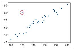
For example, when considered individually, neither the x-value nor the y-value of the circled data point is unusual. However, the data point does not fit with the correlation structure of the two variables. Therefore, the Mahalanobis distance for this point is unusually large.
To assess whether a distance value is large enough for the observation to be considered an outlier, use the outlier plot.
Scree plot
The scree plot displays the number of the principal component versus its corresponding eigenvalue. The scree plot orders the eigenvalues from largest to smallest. The eigenvalues of the correlation matrix equal the variances of the principal components.
To display the scree plot, click Graphs and select the scree plot when you perform the analysis.
Interpretation
This scree plot shows that the eigenvalues start to form a straight line after the third principal component. Therefore, the remaining principal components account for a very small proportion of the variability (close to zero) and are probably unimportant.
Score plot
The score plot graphs the scores of the second principal component versus the scores of the first principal component.
To display the score plot, click Graphs and select the score plot when you perform the analysis.
Interpretation
If the first two components account for most of the variance in the data, you can use the score plot to assess the data structure and detect clusters, outliers, and trends. Groupings of data on the plot may indicate two or more separate distributions in the data. If the data follow a normal distribution and no outliers are present, the points are randomly distributed around zero.
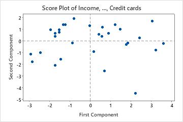
In this score plot, the point in the lower corner may be an outlier. You should investigate this point.
Tip
To see the calculated score for each observation, hold your pointer over a data point on the graph. To create score plots for other components, store the scores and use .
Loading plot
The loading plot graphs the coefficients of each variable for the first component versus the coefficients for the second component. The coefficients are the values the comprise the eigenvectors for each principle component. The coefficients indicate the relative weight of each variable in the component.
To display the loading plot, click Graphs and select the loading plot when you perform the analysis.
Interpretation
Use the plot to identify which variables have the largest effect on each component. Coefficients can range from -1 to 1. Coefficients close to -1 or 1 indicate that the variable strongly influences the component. Coefficients close to 0 indicate that the variable has a weak influence on the component. Evaluating the coefficients can also help you characterize each component in terms of the variables.
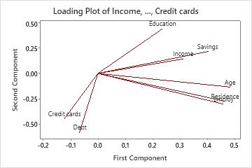
In this loading plot, Age, Residence, Employ, and Savings have large positive coefficients on component 1, so this component primarily measures applicant's financial stability. Debt and Credit Cards have large negative coefficients on component 2, so this component primarily measures an applicant's credit history.
Biplot
The biplot overlays the score plot and the loading plot.
To display the biplot, click Graphs and select the biplot when you perform the analysis.
Interpretation
Use the biplot to assess the data structure and the loadings of the first two components on one graph. Minitab plots the second principal component scores versus the first principal component scores, as well as the loadings for both components.
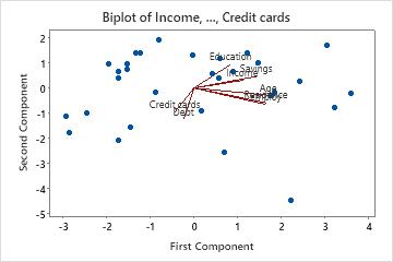
- Age, Residence, Employ, and Savings have large positive loadings on component 1. Therefore, this component focuses on an applicant's long-term financial stability.
- Debt and Credit Cards have large negative loadings on component 2. Therefore, this component focuses on an applicant's credit history.
- The point in the lower right-hand corner may be an outlier. You should investigate this point.
Outlier plot
The outlier plot displays the Mahalanobis distance for each observation and a reference line to identify outliers. The Mahalanobis distance is the distance between each data point and the centroid of multivariate space (the overall mean). Examining Mahalanobis distances is a more powerful method for detecting outliers than looking at one variable at a time because it considers the different scales between variables and the correlations between them.
To display the outlier plot, you must click Graphs and select the outlier plot when you perform the analysis.
Interpretation
Use the outlier plot to identify outliers. Any point that is above the reference line is an outlier.
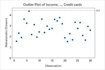
In these results, there are no outliers. All the points are below the reference line.
Tip
Hold your pointer over any point on an outlier plot to identify the observation. Use to brush multiple outliers on the plot and flag the observations in the worksheet.