In This Topic
Step 1: Determine a confidence interval for the population mean
First, consider the sample mean, and then examine the confidence interval.
The mean of the sample data is an estimate of the population mean. Because the mean is based on sample data and not on the entire population, it is unlikely that the sample mean equals the population mean. To better estimate the population mean, use the confidence interval.
The confidence interval provides a range of likely values for the population mean. For example, a 95% confidence level indicates that if you take 100 random samples from the population, you could expect approximately 95 of the samples to produce intervals that contain the population mean. The confidence interval helps you assess the practical significance of your results. Use your specialized knowledge to determine whether the confidence interval includes values that have practical significance for your situation. If the interval is too wide to be useful, consider increasing your sample size. For more information, go to Ways to get a more precise confidence interval.
Descriptive Statistics
| N | Mean | StDev | SE Mean | 95% CI for μ |
|---|---|---|---|---|
| 25 | 330.6 | 154.2 | 30.8 | (266.9, 394.2) |
Key Results: Mean, 95% CI
In these results, the estimate of the population mean for energy cost is 330.6. You can be 95% confident that the population mean is between 266.9 and 394.2.
Step 2: Determine whether the test results are statistically significant
- P-value ≤ α: The difference between the means is statistically significant (Reject H0)
- If the p-value is less than or equal to the significance level, the decision is to reject the null hypothesis. You can conclude that the difference between the population mean and the hypothesized mean is statistically significant. Use your specialized knowledge to determine whether the difference is practically significant. For more information, go to Statistical and practical significance.
- P-value > α: The difference between the means is not statistically significant (Fail to reject H0)
- If the p-value is greater than the significance level, the decision is to fail to reject the null hypothesis. You do not have enough evidence to conclude that the difference between the population mean and the hypothesized mean is statistically significant. You should make sure that your test has enough power to detect a difference that is practically significant. For more information, go to Power and Sample Size for 1-Sample t.
Descriptive Statistics
| N | Mean | StDev | SE Mean | 95% CI for μ |
|---|---|---|---|---|
| 25 | 330.6 | 154.2 | 30.8 | (266.9, 394.2) |
Test
| Null hypothesis | H₀: μ = 200 |
|---|---|
| Alternative hypothesis | H₁: μ ≠ 200 |
| T-Value | P-Value |
|---|---|
| 4.23 | 0.000 |
Key Result: P-Value
In these results, the null hypothesis states that the mean energy cost equals 200. Because the p-value is 0.00, which is less than an alpha of 0.05, you can reject the null hypothesis and conclude that the population mean cost is different from 200.
Step 3: Check your data for problems
Problems with your data, such as skewness and outliers, can adversely affect your results. Use graphs to look for skewness and to identify potential outliers.
Examine the spread of your data to determine whether your data appear to be skewed.
When data are skewed, the majority of the data are located on the high or low side of the graph. Often, skewness is easiest to detect with a histogram or boxplot.
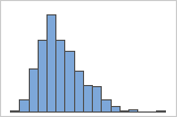
Right-skewed
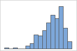
Left-skewed
The histogram with right-skewed data shows wait times. Most of the wait times are relatively short, and only a few wait times are long. The histogram with left-skewed data shows failure time data. A few items fail immediately, and many more items fail later.
Data that are severely skewed can affect the validity of the p-value if your sample is small (less than 20 values). If your data are severely skewed and you have a small sample, consider increasing your sample size.
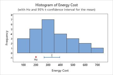
In this histogram, the data do not appear to be severely skewed.
Identify outliers
Outliers, which are data values that are far away from other data values, can strongly affect the results of your analysis. Often, outliers are easiest to identify on a boxplot.
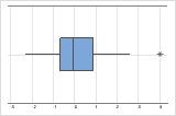
On a boxplot, asterisks (*) denote outliers.
Try to identify the cause of any outliers. Correct any data–entry errors or measurement errors. Consider removing data values for abnormal, one-time events (also called special causes). Then, repeat the analysis. For more information, go to Identifying outliers.
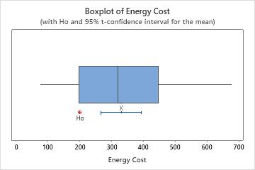
In this boxplot, there are no outliers.