In This Topic
Length
The number of observations in the time series.
α (level)
α is the weight used in the level component of the smoothed estimate. α is similar to a moving average of the observations. The weights adjust the amount of smoothing by defining how each component reacts to current conditions. Lower weights give less weight to recent data. Higher weights give more weight to recent data. Adjusting the weight for the level component usually has the best chance of improving the accuracy measures. Changing the other weights usually has a small effect after you adjust the level weight where it should be.
γ (trend)
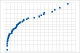
Higher weights give more influence to recent data, so the forecasts (green) follow the downward trend at the end of the data (black).
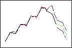
Higher trend weight
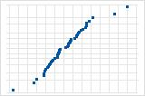
Lower weights give less influence to recent data, so the forecasts follow the overall, upward trend.
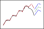
Lower trend weight
δ (seasonal)
δ is the weight used in the seasonal component of the smoothed estimate. The weights adjust the amount of smoothing by defining how each component reacts to current conditions. Lower weights give less weight to recent data. Higher weights give more weight to recent data.
MAPE
The mean absolute percent error (MAPE) expresses accuracy as a percentage of the error. Because the MAPE is a percentage, it can be easier to understand than the other accuracy measure statistics. For example, if the MAPE is 5, on average, the forecast is off by 5%.
However, sometimes you may see a very large value of MAPE even though the model appears to fit the data well. Examine the plot to see if any data values are close to 0. Because MAPE divides the absolute error by the actual data, values close to 0 can greatly inflate the MAPE.
Interpretation
Use to compare the fits of different time series models. Smaller values indicate a better fit. If a single model does not have the lowest values for all 3 accuracy measures, MAPE is usually the preferred measurement.
The accuracy measures are based on one-period-ahead residuals. At each point in time, the model is used to predict the Y value for the next period in time. The difference between the predicted values (fits) and the actual Y are the one-period-ahead residuals. Because of this, the accuracy measures provide an indication of the accuracy you might expect when you forecast out 1 period from the end of the data. Therefore, they do not indicate the accuracy of forecasting out more than 1 period. If you're using the model for forecasting, you shouldn't base your decision solely on accuracy measures. You should also examine the fit of the model to ensure that the forecasts and the model follow the data closely, especially at the end of the series.
MAD
The mean absolute deviation (MAD) expresses accuracy in the same units as the data, which helps conceptualize the amount of error. Outliers have less of an effect on MAD than on MSD.
Interpretation
Use to compare the fits of different time series models. Smaller values indicate a better fit.
The accuracy measures are based on one-period-ahead residuals. At each point in time, the model is used to predict the Y value for the next period in time. The difference between the predicted values (fits) and the actual Y are the one-period-ahead residuals. Because of this, the accuracy measures provide an indication of the accuracy you might expect when you forecast out 1 period from the end of the data. Therefore, they do not indicate the accuracy of forecasting out more than 1 period. If you're using the model for forecasting, you shouldn't base your decision solely on accuracy measures. You should also examine the fit of the model to ensure that the forecasts and the model follow the data closely, especially at the end of the series.
MSD
The mean square deviation (MSD) measures the accuracy of the fitted time series values. Outliers have a greater effect on MSD than on MAD.
Interpretation
Use to compare the fits of different time series models. Smaller values indicate a better fit.
The accuracy measures are based on one-period-ahead residuals. At each point in time, the model is used to predict the Y value for the next period in time. The difference between the predicted values (fits) and the actual Y are the one-period-ahead residuals. Because of this, the accuracy measures provide an indication of the accuracy you might expect when you forecast out 1 period from the end of the data. Therefore, they do not indicate the accuracy of forecasting out more than 1 period. If you're using the model for forecasting, you shouldn't base your decision solely on accuracy measures. You should also examine the fit of the model to ensure that the forecasts and the model follow the data closely, especially at the end of the series.
Smooth
The smoothed data is either the sum of the level component and the seasonal component (additive model) or the product of the level component and the seasonal component (multiplicative model).
Predict
The predicted values are also called fits. The predicted values are point estimates of the variable at time (t).
Observations that have predicted values that are very different from the observed value may be unusual or influential. Try to identify the cause of any outliers. Correct any data-entry errors or measurement errors. Consider removing data values that are associated with abnormal, one-time events (special causes). Then, repeat the analysis.
Error
The error values are also called residuals. The error values are the differences between the observed values and the predicted values.
Interpretation
Plot the error values to determine whether your model is adequate. The values can provide useful information about how well the model fits the data. In general, the error values should be randomly distributed around 0 with no obvious patterns and no unusual values.
Period
Minitab displays the period when you generate forecasts. The period is the time unit of the forecast. By default, the forecasts start at the end of the data.
Forecast
The forecasts are the fitted values obtained from the time series model. Minitab displays the number of forecasts that you specify. The forecasts begin either at the end of the data or at the point of origin that you specify.
Interpretation
Use forecasts to predict a variable for a specified period of time. For example, a warehouse manager can model how much product to order for the next 3 months based on the previous 60 months of orders.
Examine the fits and the forecasts in the plot to determine whether the forecasts are likely to be accurate. The fits should follow the data closely, especially at the end of the series. When using a seasonal model it is especially important to verify that the fits match the actual values at the end of the time series. If the seasonal pattern or trend do not match up with the fits at the end of the data, the forecasts are likely to be less accurate. In this case, collect more data so the model can adapt to changes in the seasonal pattern or trend.
If the model fits the data at the end of the series, you can usually safely predict at least one full seasonal cycle.
Lower and Upper
The lower and upper prediction limits produce a prediction interval for each forecast. The prediction interval is a range of likely values of forecasts. For example, with a 95% prediction interval, you can be 95% confident that the prediction interval contains the forecast at the specified time.
Winters' Method Plot
The plot displays the observations versus time. The plot includes the fits that are calculated from the smoothing procedure, the forecasts, the smoothing constant, and the accuracy measures. You can also choose to display the smoothed values instead of the fits.
Interpretation
- If the model fits the data, you can perform Decomposition and compare the two models.
- If the model does not fit the data, examine the plot for a lack of seasonality. If there is no seasonal pattern, you should use a different time series analysis. For more information, go to Which time series analysis should I use?.
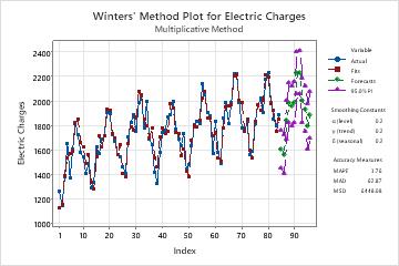
On this plot, the fits closely follow the data, which indicates that the model fits the data.
Histogram of the residuals
The histogram of the residuals shows the distribution of the residuals for all observations. lf the model fits the data well, the residuals should be random with a mean of 0. So the histogram should be approximately symmetric around 0.
Normal probability plot of the residuals
The normal plot of the residuals displays the residuals versus their expected values when the distribution is normal.
Interpretation
Use the normal plot of the residuals to determine whether the residuals are normally distributed. However, this analysis does not require normally distributed residuals.
S-curve implies a distribution with long tails.

Inverted S-curve implies a distribution with short tails.
Downward curve implies a right-skewed distribution.
A few points lying away from the line implies a distribution with outliers.
Residuals versus fits
The residuals versus fits plot displays the residuals on the y-axis and the fitted values on the x-axis.
Interpretation
Use the residuals versus fits plot to determine whether the residuals are unbiased and have a constant variance. Ideally, the points should fall randomly on both sides of 0, with no recognizable patterns in the points.
| Pattern | What the pattern may indicate |
|---|---|
| Fanning or uneven spreading of residuals across fitted values | Nonconstant variance |
| Curvilinear | A missing higher-order term |
| A point that is far away from zero | An outlier |
If you see nonconstant variance or patterns in the residuals, your forecasts may not be accurate.
Residuals versus order
The residuals versus order plot displays the residuals in the order that the data were collected.
Interpretation
Use the residuals versus order plot to determine how accurate the fits are compared to the observed values during the observation period. Patterns in the points may indicate that model does not fit the data. Ideally, the residuals on the plot should fall randomly around the center line.
| Pattern | What the pattern may indicate |
|---|---|
| A consistent long-term trend | The model does not fit the data |
| A short-term trend | A shift or a change in pattern |
| A point that is far away from the other points | An outlier |
| A sudden shift in the points | The underlying pattern for the data has changed |
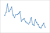
Residuals systematically decrease as the order of the observations increases from left to right.
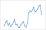
A sudden change in the values of the residuals occurs from low (left) to high (right).
Residuals versus variables
The residuals versus variables plot displays the residuals versus another variable.
Interpretation
Use the plot to determine whether the variable affects the response in a systematic way. If patterns are present in the residuals, the other variables are associated with the response. You can use this information as the basis for additional studies.