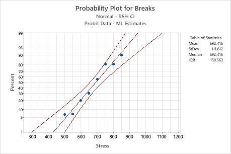
The probability plot is a graphical display of the estimated probit regression equation.
- The middle line on the graph estimates the percent of units that fail at a given level of stress.
- The upper and lower limits show an approximate 95% confidence interval for the stress that causes a certain percent of units to fail.
You can use the probability plot to do the following:
- Estimate the probability of failure at a given level of stress.
- Assess how well the chosen distribution fits your data. The closer the points fall to the middle line, the better the distribution fits the data.
Example Output
Interpretation
In the probability plot for the windshield data, more than 50% of the windshields are predicted to break at a velocity of 700 mph. In other words, the probability of failure at 700 mph is more than 0.50.
The points on the plot fall relatively close to the middle line. Thus, the normal distribution cdf is appropriate for these data.