In This Topic
Probability plot
Use the probability plot to assess how well the distribution that you selected fits your data. If the points closely follow the fitted line, then you can assume that the distribution fits the data reasonably well.
- The points on the plot are the estimated percentiles based on a nonparametric method, which does not depend on any distribution. When you hold your pointer over a data point, Minitab displays the observed failure time and the estimated cumulative probability.
- The fitted line (center line) is based on the fitted distribution. When you hold your pointer over the fitted line, Minitab displays a table of percentiles for various percents.
- The left line connects the lower bounds on confidence intervals for each percentile. The right line connects the upper bounds on confidence intervals for each percentile.
Example output
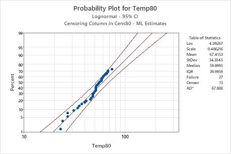
Interpretation
For the Temp80 sample of the engine winding data, the points appear to follow the fitted line. Therefore, you can assume that the lognormal distribution is an appropriate choice for the data. The fitted line is based on a lognormal distribution with location = 4.09267 and scale = 0.486216.
Survival plot
The survival plot depicts the probability that the item will survive until a particular time. Thus, the survival plot shows the reliability of the product over time.
- The center line is the estimated reliability over time.
- The right line connects the upper bounds for the reliability at each time point. The left line connects the lower bounds for the reliability at each time point.
When you hold your pointer over the survival curve, Minitab displays a table of times and survival probabilities.
Use this plot only when the distribution fits the data adequately. If the distribution fits the data poorly, these estimates will be inaccurate. Use the distribution ID plot, probability plot, and goodness-of-fit measures to determine whether the distribution adequately fits the data.
Example output
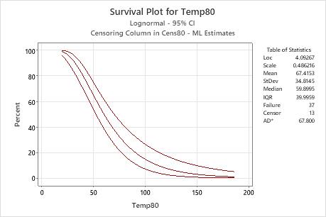
Interpretation
For the engine windings data, the probability of the engine windings surviving at a temperature of 80° C for at least 50 hours is approximately 60%. The survival function is based on the lognormal distribution with location = 4.09267 and scale = 0.486216.
Cumulative failure plot
To describe product reliability in terms of when the product fails, the cumulative failure plot displays the cumulative percentage of items that fail by a particular time, t. The cumulative failure function represents 1 − survival function.
- The center line is the estimated cumulative failure percentage over time.
- The right line connects the lower bounds for the cumulative failure percentage at each time point. The left line connects the upper bounds for the cumulative failure percentage at each time point.
When you hold your pointer over the curve, Minitab displays the cumulative failure probability and failure time.
Use this plot only when the distribution fits the data adequately. If the distribution fits the data poorly, these estimates will be inaccurate. Use the distribution ID plot, probability plot, and goodness-of-fit measures to determine whether the distribution adequately fits the data.
Example output
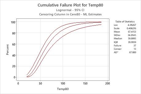
Interpretation
For the engine windings data, the probability of the engine windings failing by 70 hours at a temperature of 80° C is approximately 60%. The cumulative failure function is based on the lognormal distribution with location = 4.09267 and scale = 0.486216.
Hazard plot
- Decreasing: Items are less likely to fail as they age. A decreasing hazard typically happens in the early period of a product's life.
- Constant: Items fail at a constant rate. A constant hazard typically happens during the "useful life" of a product when failures occur at random.
- Increasing: Items are more likely to fail as they age. An increasing hazard typically happens in the later stages of a product's life, as in wear-out.
The shape of the hazard function is determined based on the data and the chosen distribution. When you hold your pointer over the hazard curve, Minitab displays a table of failure times and hazard rates.
Use this plot only when the distribution fits the data adequately. If the distribution fits the data poorly, these estimates will be inaccurate. Use the distribution ID plot, probability plot, and goodness-of-fit measures to determine whether the distribution adequately fits the data.
Example output
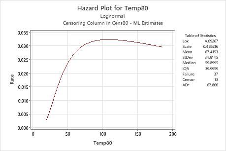
Interpretation
For the Temp80 variable of the engine windings data, the hazard function is based on the lognormal distribution with location = 4.09267 and scale = 0.486216. At a temperature of 80° C, the hazard rate increases until approximately 100 hours, then slowly decreases.
Multiple failure mode graphs
For the multiple failure data, Minitab displays graphs for each failure mode.
- Use the probability plot to assess how well the chosen distribution fits your data. If the points closely follow the fitted line, then use that distribution to model the data.
- Use the survival plot to assess the probability that the item will survive until a particular time. Thus, the survival plot displays the reliability of the product over time.
- Use the hazard function to provide the likelihood of failure as a function of how long a unit has lasted (the instantaneous failure rate at a particular time, t). The hazard plot shows the trend in the failure rate over time.
Example output
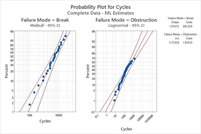
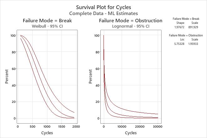
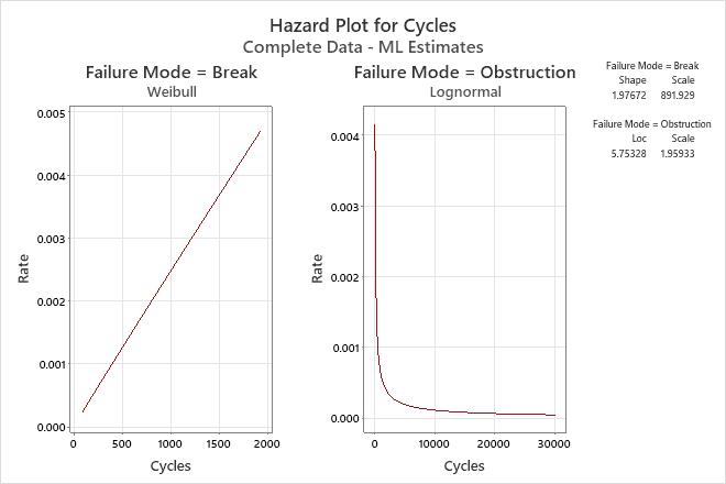
Interpretation
- Shape = 1.97672 and scale = 891.929 for spray arm breaks
- Location = 5.75328 and scale = 1.95933 for spray arm obstructions
The probability that spray arms will survive breaks for 200 cycles is 95%, and that they will survive obstructions for 1500 cycles is approximately 20%.
The hazard rate for breaks increases slightly over time, but for obstructions decreases over time.