In This Topic
Survival plot – actuarial estimation method
The survival plot depicts the probability that the item will survive until a particular time. Therefore, the plot shows the reliability of the product over time. The Y-axis displays the probability of survival and the X-axis displays the reliability measurement (time, number of copies, miles driven).
For a nonparametric analysis, the survival plot is a step function with steps at the endpoints of each interval. In this example, the function is calculated using the actuarial estimation method.
Example output
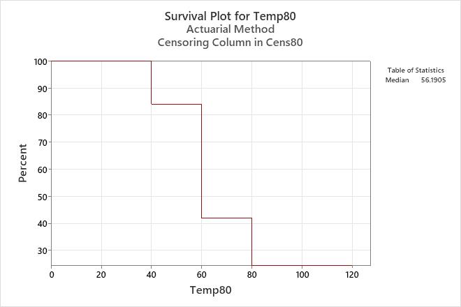
Interpretation
For the engine windings running at 80° C, the probability that a winding will survive until 60 hours is 0.42.
Cumulative failure plot – actuarial estimation method
The cumulative failure plot depicts the probability that the item will fail after a particular time. Therefore, the plot shows the failure probability of the product over time. The Y-axis displays the probability of failure and the X-axis displays the reliability measurement (time, number of copies, miles driven).
For a nonparametric analysis, the cumulative failure plot is a step function with steps at the endpoints of each interval. In this example, the function is calculated using the actuarial estimation method.
Example output
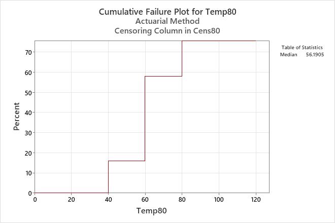
Interpretation
For the engine windings running at 80° C, the probability that a winding will fail at or before 60 hours is 0.58.
Hazard plot – actuarial estimation method
The hazard function provides a measure of the likelihood of failure as a function of how long a unit has survived. You can use the nonparametric hazard plot to help determine which distribution might be appropriate to model the data, if you decide to use parametric estimation methods.
For a nonparametric analysis, the hazard plot is a step function with steps at the midpoints of each interval. In this example, the function is calculated using the actuarial estimation method.
Example output
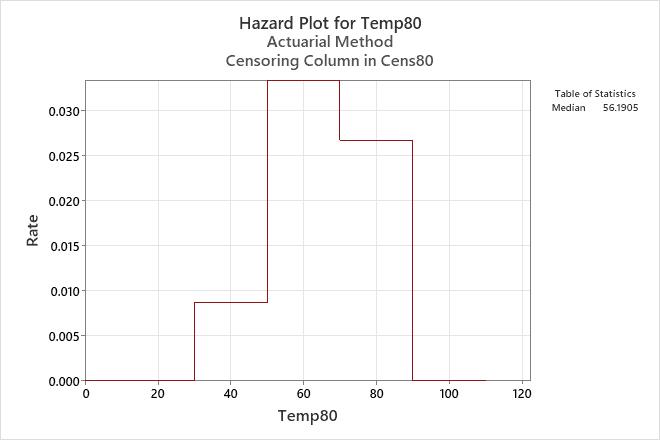
Interpretation
For engine windings running at 80° C, the hazard function increases until the interval from 50 to 70 hours, and then decreases after 70 hours.
Multiple failure mode graphs – actuarial estimation method
For the multiple failure data, Minitab displays graphs for each failure mode.
- Use the survival plot to assess the probability that the item will survive until a particular time. The survival plot shows the reliability of the product over time.
- Use the hazard function to view the likelihood of failure as a function of how long a unit has survived (the instantaneous failure rate at a particular time, t). The hazard plot shows the trend in the failure rate over time.
Example output
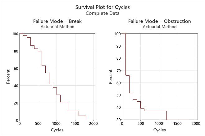
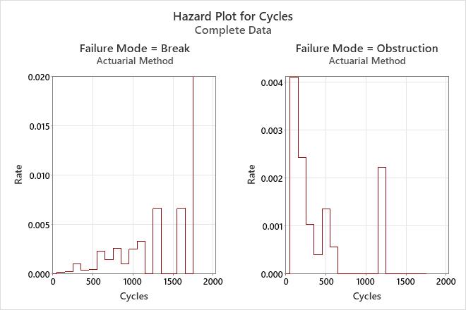
Interpretation
For the dishwasher data, the probability that spray arms will survive breaks for 200 cycles is 95%, and that they will survive obstructions for 200 cycles is 51%.
The hazard rate for breaks seems to increase slightly over time. However, the hazard rate for obstructions seems to decrease over time.