In This Topic
Survival plot – actuarial estimation method
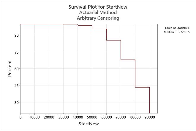
The survival plot depicts the probability that the item will survive until a particular time. Thus, the plot shows the reliability of the product over time. The Y-axis displays the probability of survival and the X-axis displays the reliability measurement (time, number of copies, miles driven).
For a nonparametric analysis, the survival plot is a step function with steps at the endpoints of each interval. In this example, the function is calculated using the actuarial estimation method.
Example output
Interpretation
For the new muffler data, the probability that the new type of mufflers will survive until 50,000 miles is 0.95. In other words, the mufflers have a 95% chance of surviving until 50,000 miles.
Cumulative failure plot – actuarial estimation method
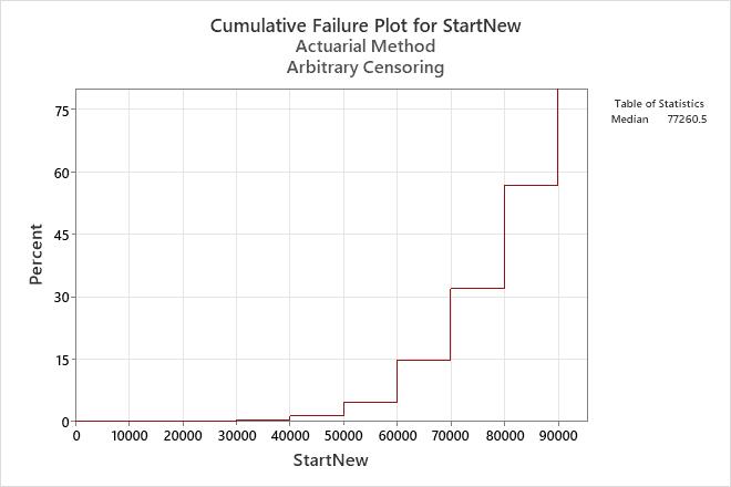
The cumulative failure plot depicts the probability that the item will fail after a particular time. Therefore, the plot shows the failure probability of the product over time. The Y-axis displays the probability of failure and the X-axis displays the reliability measurement (time, number of copies, miles driven).
For a nonparametric analysis, the cumulative failure plot is a step function with steps at the end points of each interval. In this example, the function is calculated using the actuarial estimation method.
Example output
Interpretation
For the new muffler data, the probability that the new type of mufflers will fail by 50,000 miles is 0.05. In other words, the mufflers have a 5% chance of failing at or before 50,000 miles.
Hazard plot – actuarial estimation method
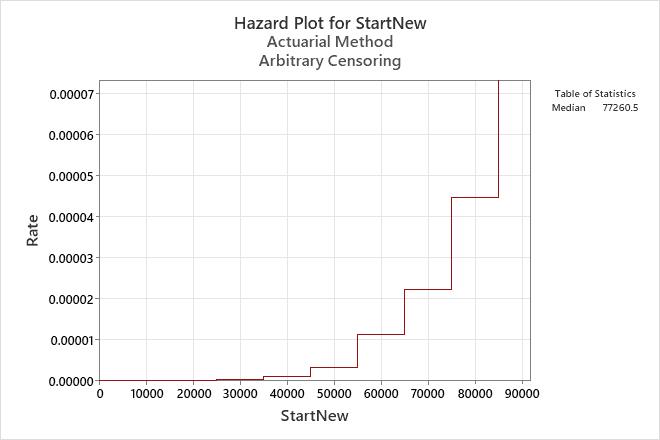
The hazard function shows the likelihood of failure as a function of how long a unit has survived. You can use the nonparametric hazard plot to help you determine which distribution might be appropriate to model the data, if you decide to use parametric estimation methods.
For a nonparametric analysis, the hazard plot is a step function with steps at the midpoints of each interval. In this example, the function is calculated using the actuarial estimation method.
Example output
Interpretation
For the new muffler data, the hazard function is increasing. Thus, the reliability group considers using a distribution that has an increasing hazard function.
Multiple failure mode graphs – actuarial estimation method
For the multiple failure data, Minitab displays graphs for each failure mode.
- Use the survival plot to assess the probability that the item will survive until a particular time. The survival plot displays the reliability of the product over time.
- Use the hazard function to view the likelihood of failure as a function of how long a unit has survived (the instantaneous failure rate at a particular time, t). The hazard plot shows the trend in the failure rate over time.
Example output


Interpretation
For the water pump data, 84% of the water pumps survived bearing failures for at least 60,000 miles, and 75% of the pumps survived gasket failures for at least 60,000 miles.
The hazard rate for each failure mode appears to increase slightly over time until it reaches a peak, then declines.